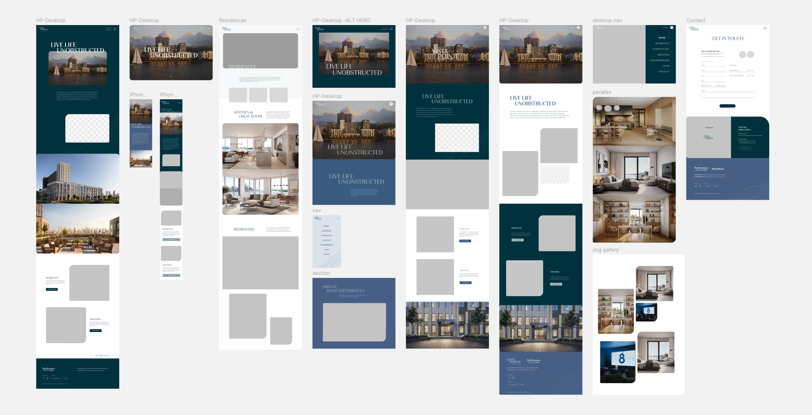
Overview
From blank page to a luxury brand and a site that converts.
Vista Pointe at Port Imperial is a luxury condominium community perched above the Hudson River in Weehawken, NJ, with direct sight lines to the Manhattan skyline. I was brought in to build it all: a brand identity system from scratch, then a lead-generating marketing website to support the community launch. The two workstreams ran in close sequence, brand first, then web, with the brand system directly informing every visual and UX decision on the site.
Brand Identity
Logo, typography, color palette, brand voice, and identity guidelines for the Vista Pointe community
UX Design
Information architecture, user flows, wireframes, and content strategy for the marketing site
UI & Visual Design
High-fidelity site design, component library, and developer handoff - brand applied to every surface
Brand Discovery
The brief: modern, & elegant, anchored to the amazing view.
The brand brief was clear in its ambition: draw from the panoramic views of the Manhattan skyline, the Hudson River, and the architecture of the new building at Port Imperial. The identity needed to feel modern, expensive, and elegant.
The target segments spanned Young Families, Professional Couples, Independents and Singles, Empty Nesters, and New Retirees, a wide audience unified by a shared value: they're buying a lifestyle, not just a home. The brand needed to sell the view and the feeling, not the floor plan.
Brand Audit & Competitive Review
I began by auditing how comparable luxury condo communities in the New York metro area expressed themselves visually. The opportunity was to feel distinctly of this location: the river, the geometry of the building, the horizon, rather than default to generic luxury tropes.
Competitive audit - identifying local visual conventions to lean into and deliberate departures.
Defining the Brand Pillars
- Elevated Perspective - The view is the product. Every brand touchpoint should evoke height, horizon, and expansiveness.
- Quiet Luxury - Understated over ornate. Confidence over decoration. The identity earns attention through restraint, not excess.
- Connected to Place - The Hudson River and the Manhattan skyline are not backdrop - they're the reason this address exists. The brand should make that inseparable.
Concept Exploration
Three directions. One chosen.
Before presenting to stakeholders, I developed three distinct brand concepts, each a fully resolved direction with its own logic, not just a variation in color or type. The goal was to give decision-makers a genuine choice: different moods, different positionings, different bets on what Vista Pointe buyers respond to. All three were grounded in the brief, but each took it somewhere different.
Concept 01 - Perspective
VIEWS | EXPANSE | SCALE | URBAN | INDUSTRIAL | DETAILS
Concept 02 - Open
FREEDOM | VIEWS | CLARITY | FRESH | CONNECTION | CURVES
Concept 03 - Natural · Chosen
EARTHY | LOCAL | SEASONAL | RIVER | WATER | WAVES
Chosen concept - Colors were refined with softer sky blues and natural greens to better reflect the Hudson River waterfront setting and surrounding landscape.
Why three, not one: Presenting three distinct directions isn't just process - it's a way of de-risking the decision. Stakeholders can articulate what they don't want as clearly as what they do, and the conversation between concepts often surfaces brand values that weren't explicit in the brief. The elements of Concepts 01 and 02 that stakeholders responded to most positively were folded into the final refinement of 03.
Approved Color Palette
Typography
Key Brand Decisions
Deep teals and layered blues reflect the waterfront views while soft sage and mist tones create a calm, modern luxury feel. Clean neutrals and black accents add sophistication and contrast throughout the brand.
Script / calligraphic wordmark. Explored a cursive name treatment that felt romantic and premium. Ultimately rejected script typefaces test poorly at small sizes and on digital surfaces, and the community's modern architecture called for a more structured mark.
Serif + sans pairing over all-sans system. A luxury real estate brand needs warmth and prestige, an all-sans system read as too corporate and undifferentiated. The serif headline creates gravitas; the sans keeps digital readability and modern clarity.
Brand Delivery
A complete system, ready to apply everywhere.
The final brand system was delivered as a comprehensive identity package - covering primary and secondary logo lockups, color palette with usage rules, full type hierarchy, photography art direction guidance, and a suite of brand application examples. This gave marketing, the developer team, and any future production partners a clear, unambiguous guide to the brand.
Web Discovery
Understanding what a luxury condo buyer needs from a website.
With the brand in place, the next challenge was translating it into a marketing website that could do real work: capture qualified leads, tell the Vista Pointe story, and convert interested buyers into appointments.
User Research & Audience Mapping
- Remote discovery buyers - young families and professional couples researching from the city or out of state. They needed strong photography, location context, and an easy path to register interest before visiting.
- Active shoppers - buyers already touring the area who came to the site for floor plans, pricing, and availability. They needed fast access to specifics, not more brand storytelling.
- Referred buyers - empty nesters and retirees often arrived via word-of-mouth. They were already warm but needed to see the lifestyle story told compellingly before committing to a visit.
User Goals
- Understand what Vista Pointe is and why the location is special
- Browse floor plans, and availability without friction
- Register interest or schedule a tour with minimum barrier
- Get a feel for the community and lifestyle, not just the specs
Business Goals
- Capture qualified lead inquiries to fuel the sales pipeline
- Establish the brand premium before a buyer sets foot on-site
- Support the community launch timeline with a live site at opening
- Differentiate Vista Pointe from competitive communities in the market
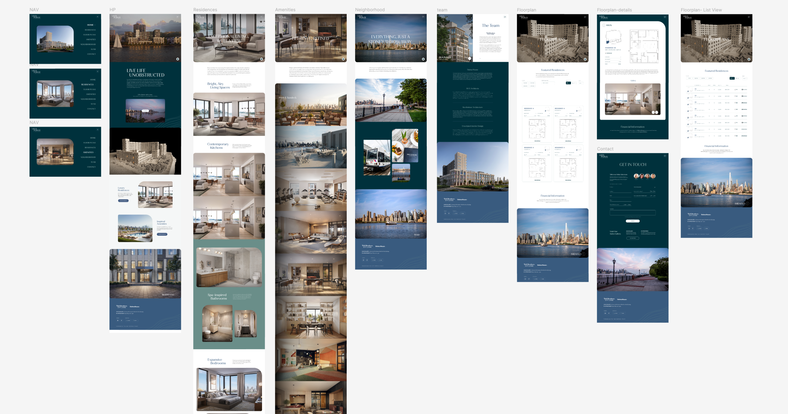
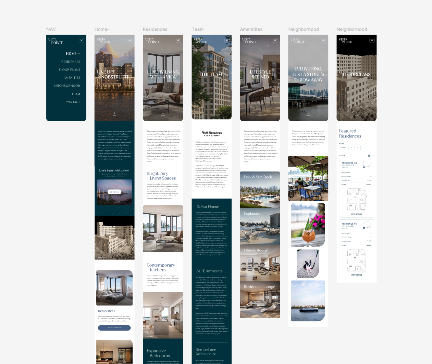
Web Design
Designing a site where the brand does the selling.
The design challenge was letting the brand and specifically the images/renderings of the view, carry the heaviest lifting. Luxury marketing sites live or die by their ability to create desire before the visitor reaches any transactional content. I designed the site to give the view maximum canvas at entry, then progressively introduce lifestyle story, residences, and finally the conversion point.
Wireframes & Layout Exploration
High-Fidelity Design
The final design applied the full brand system to every surface, headline typography, color palette, spacing rhythm, and the logo mark, creating a site that felt unmistakably Vista Pointe rather than a generic Toll Brothers community page. Key design decisions included full-viewport hero photography on entry, a scroll-driven narrative structure on the homepage, and a residences section built to make floor plan browsing feel as premium as the brand itself.
Stakeholder feedback highlighted that the original amenities page felt too much like a feature checklist, with stacked images and labels that didn’t fully capture the experience of living at Vista Pointe. The updated design shifts the focus to storytelling using larger imagery, refined spacing, and editorial-style moments to create a more aspirational, lifestyle-driven experience.
Original Amenities Page
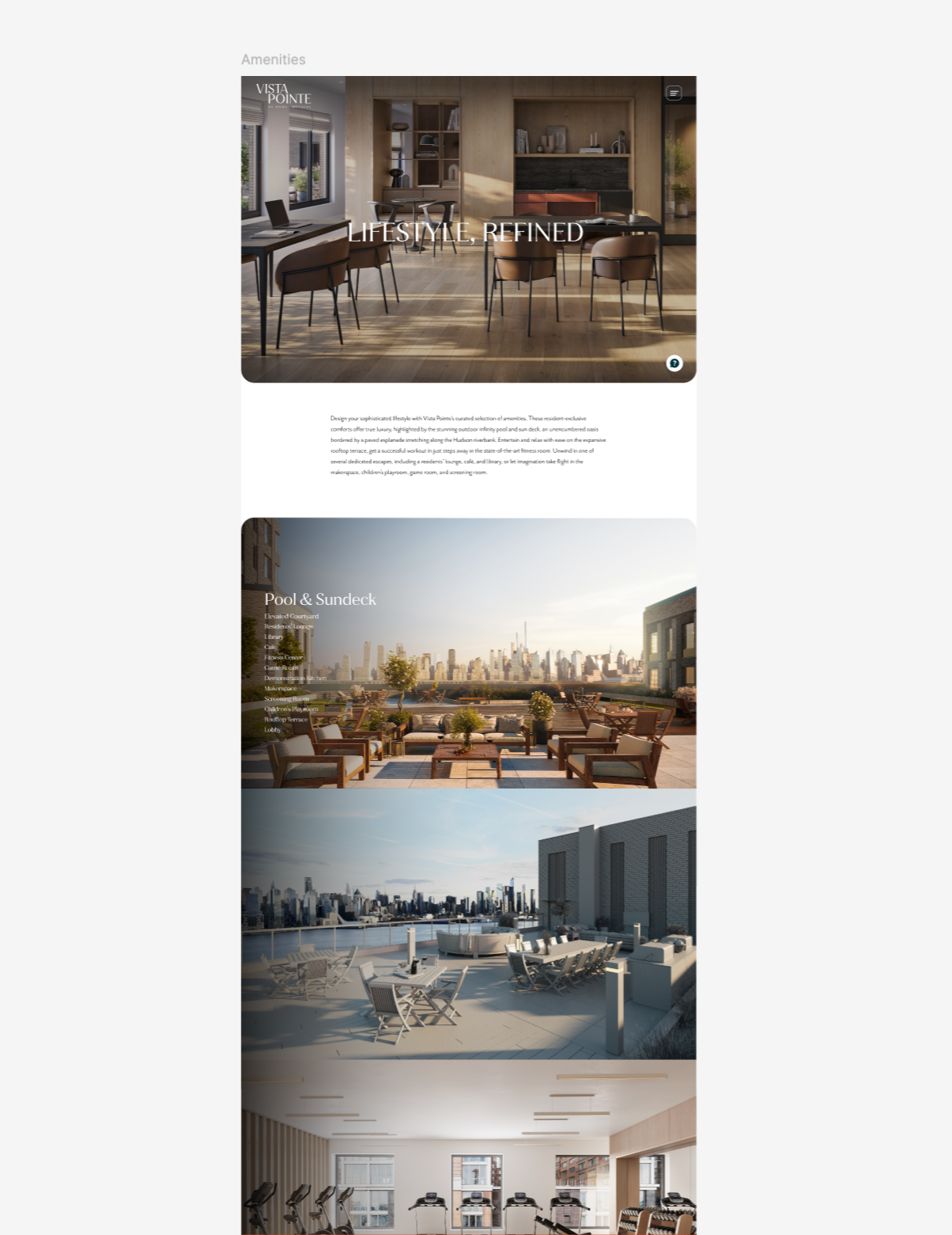
Redesigned Amenities Page
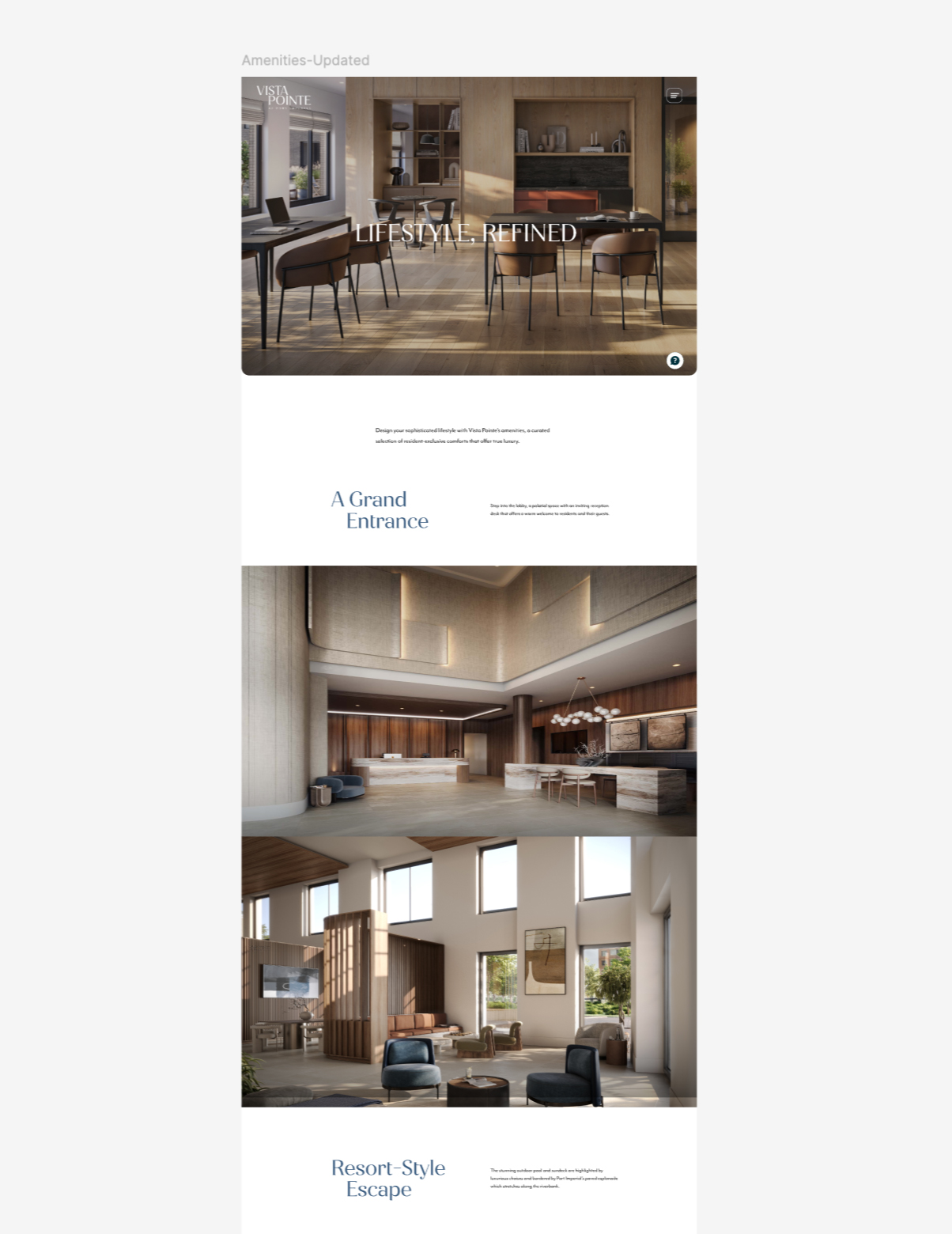
Reframed the content hierarchy
Moved from a sparse parallax layout to a more immersive, moment-based experience that highlights key spaces and amenities - matching how buyers naturally imagine where they’ll spend their time.
Preserved the page's SEO and CTA structure
The visual redesign didn't require a structural rebuild - the existing page slots were reskinned and reordered rather than rearchitected, keeping the dev handoff timeline intact while delivering a meaningfully better experience.
Timeline note: This redesign happened in the window between final stakeholder sign-off and developer handoff. The decision to absorb this round of revision rather than defer it to a post-launch update was the right call: amenities is one of the highest-intent pages a buyer visits before registering, and a weak version would have cost leads.
Key Design Decisions
Full-viewport hero with no headline overlay at entry. The view needed to land first - uninterrupted. Copy and navigation appear on scroll. This decision prioritized emotional impact over immediate information delivery, consistent with how luxury real estate sells.
Interactive floor plan viewer. An interactive floor plan with hotspot overlays was explored and scoped, but deferred to a post-launch phase given the development timeline and the number of floor plan configurations still being finalized by the builder at launch. PDFs were used as an interim solution.
The original concept of a live waterfront webcam was ultimately not pursued. While the idea aimed to showcase real-time views and reinforce the connection to the riverfront setting, the experience introduced technical and maintenance concerns that outweighed the long-term value. The focus shifted toward curated photography and cinematic visuals that delivered a more consistent, elevated brand experience across all devices.
Brand system as design constraint (the good kind): Having built the brand system first meant that visual decisions on the site were never arbitrary, every type choice, color application, and spacing decision had a defined rule to reference. The site shipped with more visual consistency than a typical community page precisely because the brand existed before the first wireframe.
Web Launch
A brand-ready site live in time for community opening.
View SiteReflection
What this project taught me about brand-led design.
Vista Pointe was one of the few projects I've worked on where the brand and the digital product were designed by the same person, in the same room, at the same time. That's a rare position and it fundamentally changed the quality of the output. The site didn't feel like a brand applied to a template; it felt like a single design vision expressed across two mediums.
"When brand and UX are designed together, the site doesn't need to explain itself, it just feels right from the first scroll."
What I'd Do Differently
- Involve buyers earlier in brand validation. The brand was validated through internal stakeholder review, which is efficient but limited. A short round of perception testing with buyers from the target segments - even informal, would have added confidence that the "luxury" signal was landing the way we intended it to.
- Push for the interactive floor plan sooner. The deferred floor plan viewer was the right call given the timeline, but it left a gap in the experience that the PDF solution didn't fill elegantly. A stronger case for a phased interactive build from the start would have served buyers better.
Looking Ahead
- Evolving the site to include an interactive floor plan and availability system — real-time inventory connected to the sales pipeline, bringing the ISP experience to the marketing site.