Overview
A development project under scrutiny needed to earn trust - fast.
West Thirty Six is a joint-venture residential development in Maricopa County, Arizona, facing local scrutiny over rezoning and community impact. Before a single home could be built, the project needed to earn public trust, from residents and community leaders to regulators and potential investors.
The ask: design and deliver a public relations microsite in one week that communicated the project's vision with clarity, credibility, and neutrality. Overt developer branding would have undermined the community-forward tone the project required. The site had to feel informational, not promotional.
My Ownership on This Project
Competitive Research
Audited how other developers handle community outreach — static PDFs, newsletters, and microsites — and identified gaps in readability, mobile usability, and engagement
Style Tile & UI Kit
Built a visual language from scratch: color palette, typography system, icon set, and background pattern — all calibrated to feel serene and credible rather than branded
Mobile-First Prototype
Delivered hi-fi, mobile-first screens for all site sections within the one-week window — from sketches to dev-ready handoff in Sketch and Figma
Discover
Existing developer outreach was failing the communities it was meant to serve.
Before designing anything, I needed to understand how other homebuilders and developers communicate with communities during contentious development processes. The landscape was discouraging: static PDFs buried on county websites, hard-to-navigate government portals, newsletters with no mobile consideration, and developer microsites so branded they read as marketing rather than information.
Research Methods
- Competitive analysis - audited community outreach approaches from other homebuilders and municipal development projects, including static PDFs, government portals, newsletters, and purpose-built microsites
- Readability audit - evaluated existing examples for information hierarchy, scannability, and accessibility on mobile devices, where most community members would be accessing the content
- Engagement gap analysis - identified the absence of meaningful feedback channels, update mechanisms, and ways for residents to signal support or raise concerns without attending a public meeting
Competitive analysis. Existing examples ranged from government portals with poor hierarchy to branded developer sites that read as marketing. None were mobile-optimized or genuinely community-forward.
Key Findings
Mobile access
Primary
Community members - particularly residents would be accessing the site primarily on mobile. None of the benchmarked examples were designed with mobile as the lead experience.
Trust signals
Absent
Existing developer sites leaned heavily on brand identity, which actively undermined credibility with skeptical residents. Neutrality and transparency had to be the design brief.
Update frequency
Critical
Residents and regulators needed a reliable place to track project milestones. No existing examples had modular update sections that felt easy to maintain or read at a glance.
Feedback channels
Missing
There was no two-way communication in any of the benchmarked examples. Giving residents a real way to ask questions or express support was a meaningful differentiator.
Define
Different audiences needed different things, the site had to serve all of them without feeling built for any one.
The design challenge was to create a single experience that felt credible and accessible.
User Needs
- Clarity on what the project is and what it means for the community
- Easy access to updates, timeline milestones, and public meeting details
- A real channel to ask questions and express support or concern
- Credibility — the site needs to feel trustworthy, not promotional
Business Goals
- Launch quickly — public perception was already forming
- Build goodwill and transparency before regulatory hearings
- Avoid overt branding that would undermine the community tone
- Create a maintainable structure for ongoing content updates
Design Objectives
Neutral, credible visual identity
Design a style tile that felt rooted in the land, desert palette, natural photography, topographic texture — rather than a developer's brand. Keywords: Tranquility, Calm, Serene, Warm.
Mobile-first information architecture
Structure all content for vertical mobile reading, modular sections, clear hierarchy, and easy navigation through a hamburger menu — given that most residents would arrive on their phones.
Regularly updatable content modules
Design the timeline, news, and status sections as modular, easy-to-update blocks — critical given the one-week turnaround and the expectation that content would evolve through the approval process.
Design Process
From hand sketch to hi-fi in a week with smart component reuse keeping it possible.
Speed was non-negotiable. With a one-week window, I moved from quick hand sketches directly into style tile and UI kit work, then into high-fidelity mobile screens, skipping mid-fi and leaning on modular component reuse to compress the timeline without losing quality.
Ideation — Hand Sketches
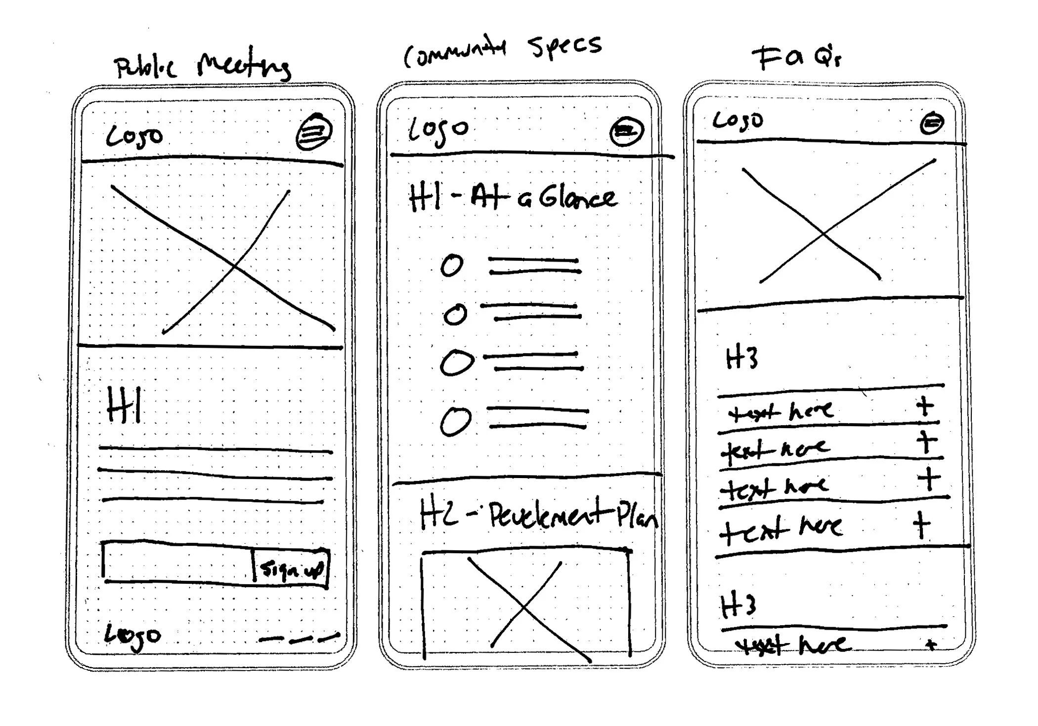
Early low-fi sketches explored layout structures for Public Meetings, Community Specs, and FAQs — focusing on modular sections that could be quickly updated as project milestones evolved.
Visual Language - Style Tile & UI Kit
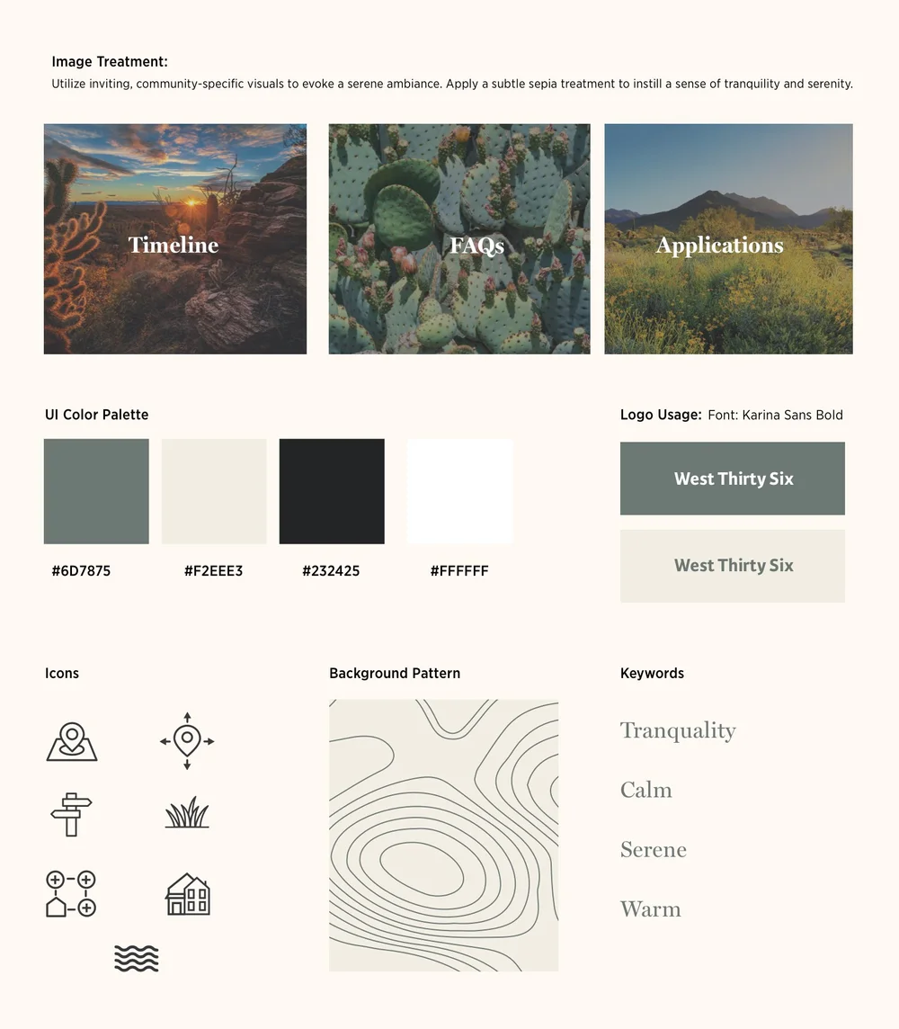
Style tile. Color palette anchored in sage (#6D7875) and warm off-white (#F2EEE3). Topographic background pattern. Keywords: Tranquility, Calm, Serene, Warm.
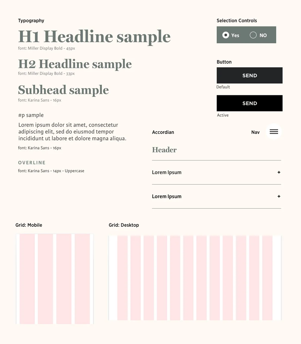
UI kit. Miller Display Bold for headlines, Karina Sans for body and UI. Button states, accordion component, selection controls, mobile and desktop grid defined before any screen work began.
Key Design Decisions
No developer logo or brand colors - the site uses a nature-derived palette tied to the Arizona landscape rather than any Toll Brothers or joint-venture branding. This was deliberate: trust required the site to feel like the community's, not the developer's.
Timeline component reused from a prior project - rather than rebuilding from scratch, I adapted an existing timeline component, enabling faster delivery and consistency with an established pattern. This iterative reuse was a practical time-saver that didn't compromise quality.
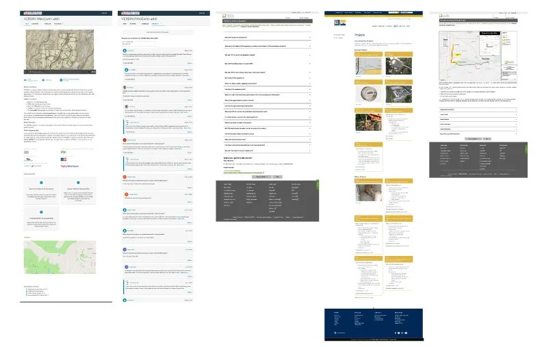
Hi-Fi Mobile Screens
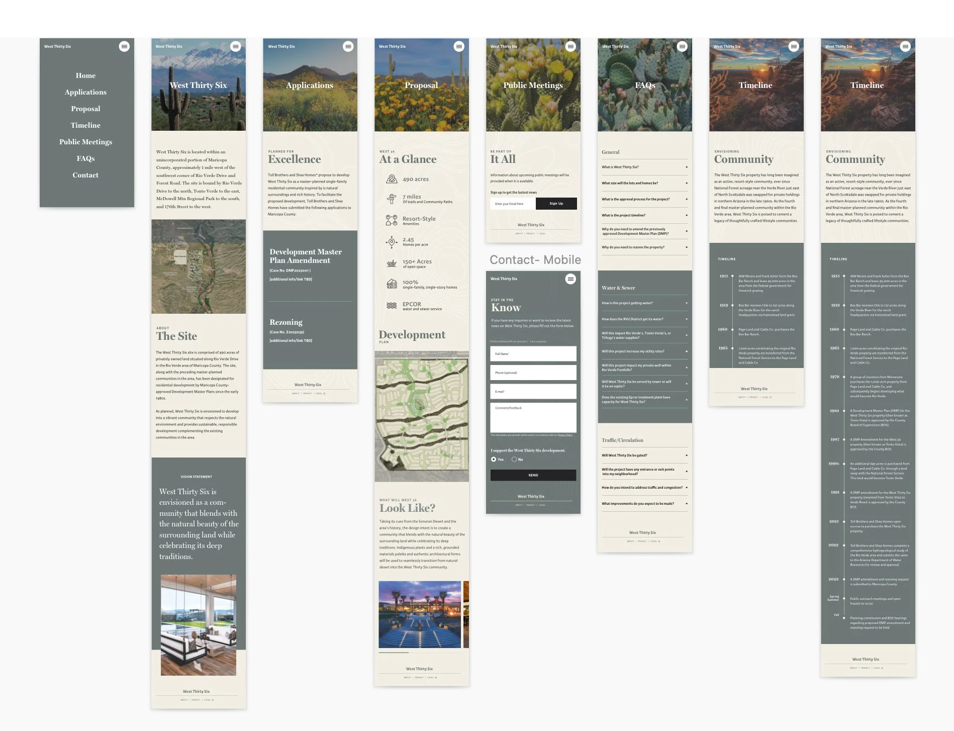
Hi-fi mobile prototype across all eight sections: Home, Applications, Proposal, Public Meetings, FAQs, Timeline, Community, and Contact. Each section modular and independently updatable.
Deliver
A neutral, mobile-first microsite that launched in a week - and helped ease local concerns.
The final site delivered a clean, credible experience that served residents, regulators, and investors from the same design system — without feeling built for any single audience. The modular structure meant the development team could update the timeline, add news posts, and manage feedback without touching the design.
"The site needed to feel like it belonged to the community — not like another developer trying to sell them something."
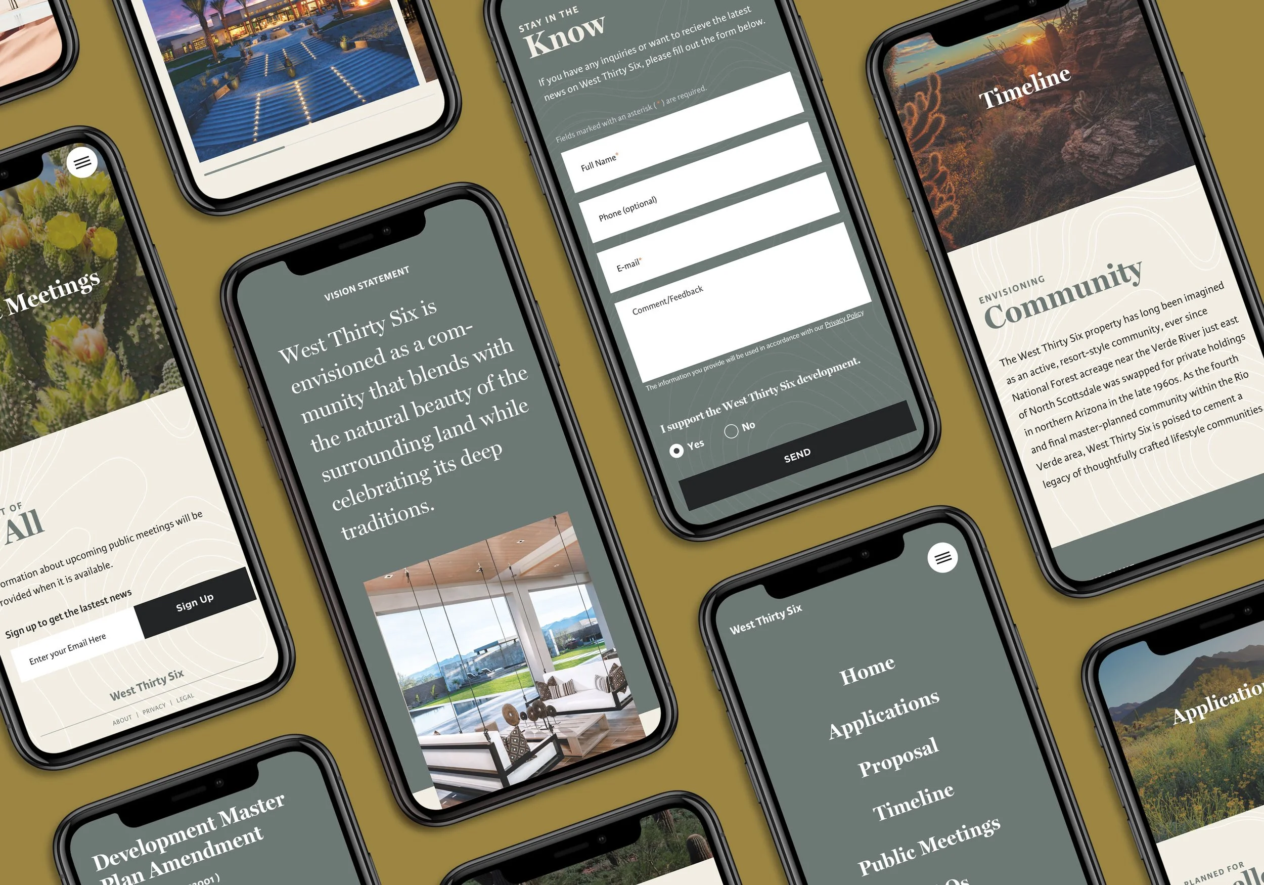
Final delivered designs, mobile-first screens shown across devices. The warm gold background, desert photography, and sage palette combine to signal trustworthiness and connection to place.
Final Design Highlights
- Neutral visual identity — no developer branding; a nature-derived palette and community-specific photography positioned the site as informational rather than promotional
- Mobile-first throughout — all eight sections designed for vertical mobile reading first, with clear hierarchy, large touch targets, and a hamburger nav that doesn't compete with content
- Modular update structure — timeline, news, and status sections built as independent, easy-to-maintain blocks to accommodate milestone updates through the approval process
- Two-way feedback channel — a contact/comment form with support-or-oppose toggle gave residents a real way to engage beyond passive reading — a meaningful differentiator from all benchmarked examples
- Timeline component reuse — adapting a prior-project component saved hours and delivered a polished, tested pattern without reinventing it under deadline pressure
Reflection & Next Steps
What this sprint proved and what would come next if the project resumes.
The project launched successfully and on time, but is currently paused due to shifting development priorities. That said, the sprint itself was one of the clearest demonstrations in my work of what agile UX can deliver under real pressure — a full design system, eight screens, and a live site in a single week.
"One week is enough time to design something good, if you're ruthless about scope and smart about reuse."
If the Project Resumes
- Running usability testing with actual community members - the sprint moved too fast for any meaningful participant testing; validating the FAQ structure and navigation patterns with local residents would be the first post-launch priority
- Exploring a multilingual version - Maricopa County's population includes a significant Spanish-speaking community; a translated version would meaningfully expand reach and demonstrate genuine inclusivity