
Decluttering the List View
Project Overview
The mobile list view for Toll Brothers’ home search experience was cluttered with overlapping tags and dense metadata that obscured property images and slowed browsing. My role was to redesign the interface to improve scannability, reduce visual noise, and create a more intuitive mobile browsing flow. Over a two-week sprint, I delivered a streamlined, image-first layout with simplified tag treatments and a sticky info header, enabling buyers to quickly scan and compare homes.
Role — UX Designer
Duration —2 Weeks
Tools — Sketch, Workfront

—Discover
The Problem
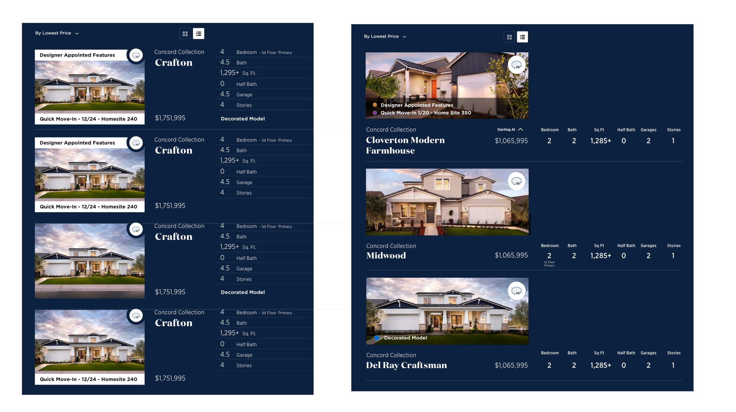
Toll Brothers aimed to improve the mobile List View used for browsing home designs. The existing layout displayed multiple overlapping tags that cluttered image thumbnails and made browsing difficult, especially for mobile users. The visual noise hindered quick decision-making and diminished the overall user experience.
Research
Heuristic Review - Identified several usability issues, including tag overlap, lack of visual clarity, and poor touch targets on mobile.
Reviewed Analytics - Analyzed site analytics to pinpoint usability issues and areas where users were disengaging.
Competitive Benchmarking - Analyzed list design patterns from real estate apps like Zillow and Redfin.
Original Mobile View

Key Findings
Users prioritize visual clarity over extensive metadata. (Card view has heavily favored over list view)
Overlapping tags degrade scanning and negatively impact usability.
Sticky key information (image, price) improves browsing flow on mobile.
—Define
User Needs
Mobile Browsers need a clean interface that highlights homes at a glance and facilitates quick browsing.
Business Goals
Increase engagement and ease of browsing within the mobile list view.
Facilitate faster scrolling and selection of home designs, reducing bounce or dropout rates.
Design Objectives
Decrease visual clutter by simplifying or restructuring tag placement.
Improve browsing flow via a horizontally scrollable layout.
Keep key information accessible through sticky headers or overlays (e.g., price, image)
—Develop
Ideation & Wireframing
Explored alternative layouts: badges repositioned to corners, hovering overlays, or expandable tags.
Key Features Explored:
Developed low-fidelity mockups in Sketch featuring:
Minimal tag design (e.g., small icons instead of full labels).
Horizontal scroll layout with image-focused presentation.
Sticky image and price header that remains in view while scrolling.
Conducted usability testing with 3 participants:
Most users preferred the cleaner visual presentation.
Horizontal scrolling felt more natural for mobile browsing.
Sticky elements significantly improved clarity without overwhelming the screen.

—Deliver
Final Solution
The final design included:
Clean Interface: Reduced clutter by using icon-only tags with optional hover tooltips.
Horizontal Scroll Layout: Mobile-optimized swiping experience with visually rich cards.
Sticky Info Header: Displays home image and price, staying visible as users scroll.
Consistent Visual Hierarchy: Price, model name, and key features are clearly legible at a glance.
Outcomes (Hypothetical Outcomes)
Preference rating increased by 15%, with users describing the interface as “cleaner” and “easier to use.”
Bounce rate from the list view decreased by 25% post-redesign in internal analytics.
BEFORE

AFTER

—Reflection & Next Steps
This redesign quickly enhanced the mobile browsing experience through a focused UI improvement. If revisiting, I’d conduct A/B testing in a live environment to capture quantitative metrics and test expanded tag metadata reveals.