Overview
A brand touchpoint that needed to earn the trust it was asking for.
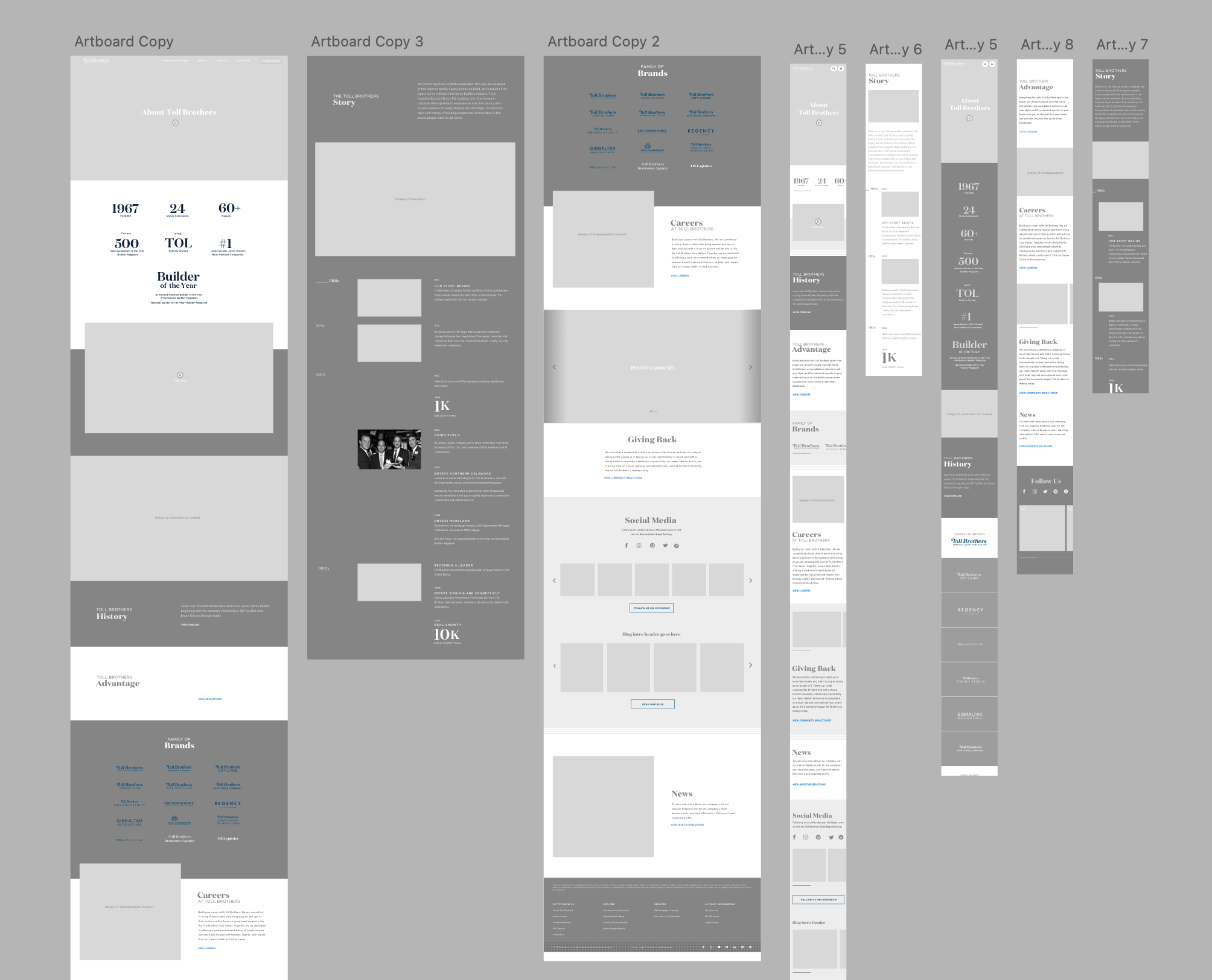
The Toll Brothers About page is a key touchpoint for prospective buyers and partners - often the first place someone goes to understand who they're doing business with. But its previous design failed to make that first impression count: no visual hierarchy, dense text blocks, and no clear direction for what to do next.
Over four weeks, I led the redesign into a mobile-first, story-driven experience - one that communicates the company's heritage, craftsmanship, and values while guiding users naturally toward communities, careers, and design studios.
Discover
A page that talked at users instead of connecting with them.
The existing About page was text-heavy and visually flat, a wall of copy that didn't reflect the premium brand Toll Brothers had built over decades. On mobile especially, the experience felt uninviting and hard to scan. There were no meaningful visual anchors and no clear calls to action to continue exploring the site.
Original desktop - dense copy, no visual hierarchy, weak brand presence.
Original mobile - the layout broke down entirely at smaller sizes.
Research Methods
- Competitive analysis of About pages across luxury real estate and lifestyle brands to identify best practices and visual benchmarks.
- Mobile usability audit to assess text readability, navigation flow, and layout effectiveness at key breakpoints.
- Stakeholder Alingment - Met with Content Team and Branding on messaging, tone, and high-value user pathways.
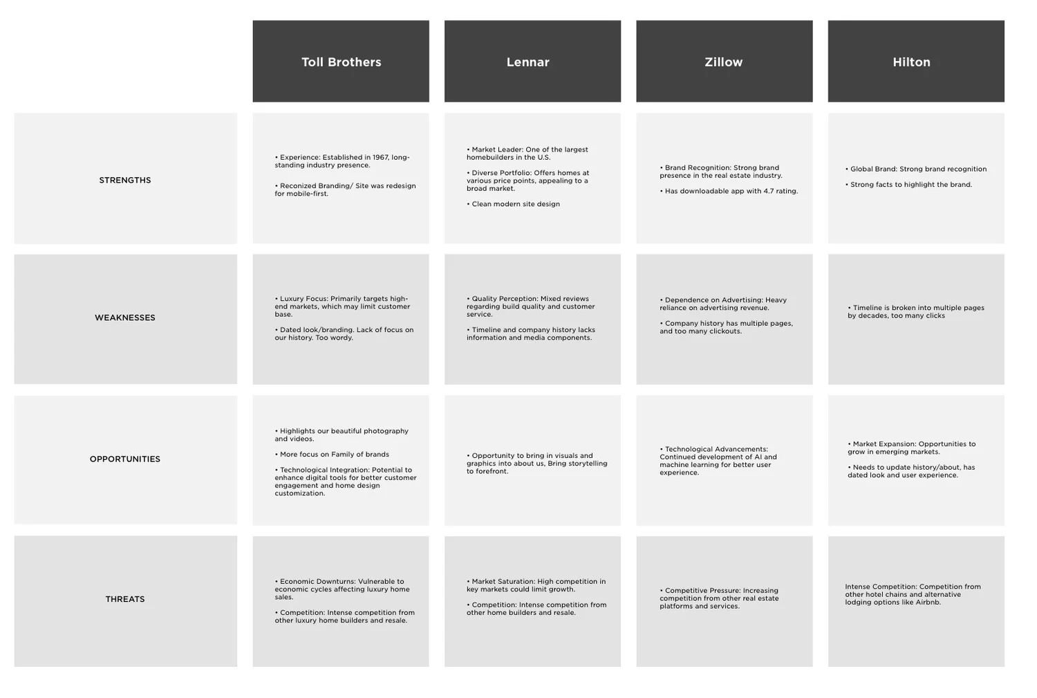
Competitive analysis - mapping patterns from luxury real estate, hospitality, and lifestyle brands.
Key Findings
- Visitors expect a homepage-like introduction - a strong visual anchor and immediate access to storytelling elements that build emotional connection.
- Lack of visual hierarchy and mobile responsiveness made the page feel uninviting and difficult to trust as a premium brand.
- No clear navigation pathways to high-value destinations like communities, design studios, or careers.
Define
Different users, one shared need: a reason to believe.
User Needs
- Prospective buyers want to quickly understand what sets Toll Brothers apart, heritage, craftsmanship, and personalization
- Job seekers and partners need to feel connected to the culture and see clear opportunities
- All visitors need a clear path forward, not a dead end
Business Goals
- Enhance brand perception through compelling storytelling
- Increase time-on-page engagement metrics
- Drive user flow to Explore Locations, Design Studios, and Careers
Design Objectives
Clarify visual hierarchy
Lead the eye through story, mission, and next steps, using scale, spacing, and contrast rather than decoration.
Improve mobile readability and navigation
Redesign from the smallest screen up, ensuring the brand story landed with the same impact on a phone as on a desktop monitor.
Embed strategic calls to action
Place CTAs contextually within the story, not bolted on at the end, so users reach them at the moment of highest engagement.
Design Process
From rough sketches to a story that scales.
The design process started with layout sketches exploring how narrative momentum could be built section by section - leading users through heritage, values, and mission before ever asking them to act. Low-fidelity prototypes were tested on mobile first, then refined with stakeholder feedback.
Key Features Explored
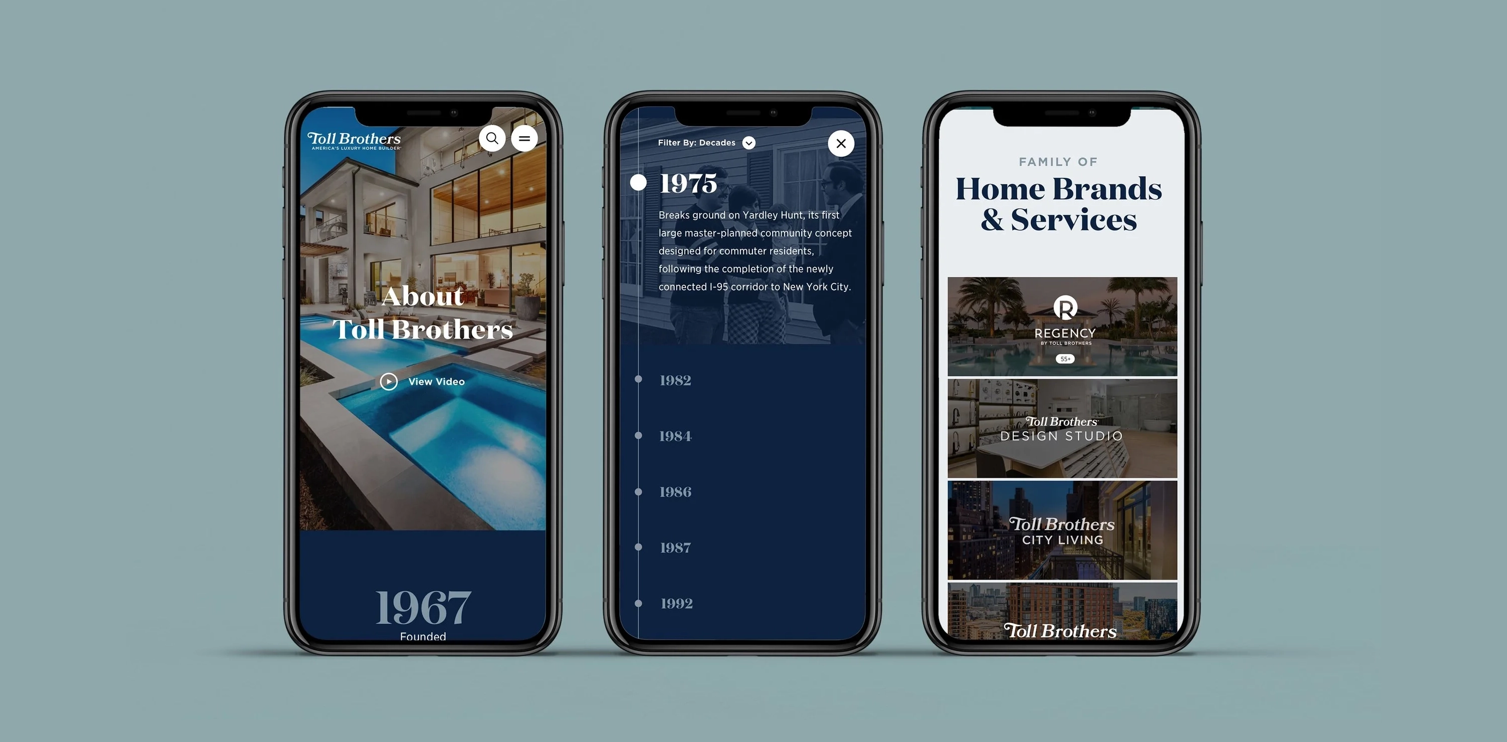
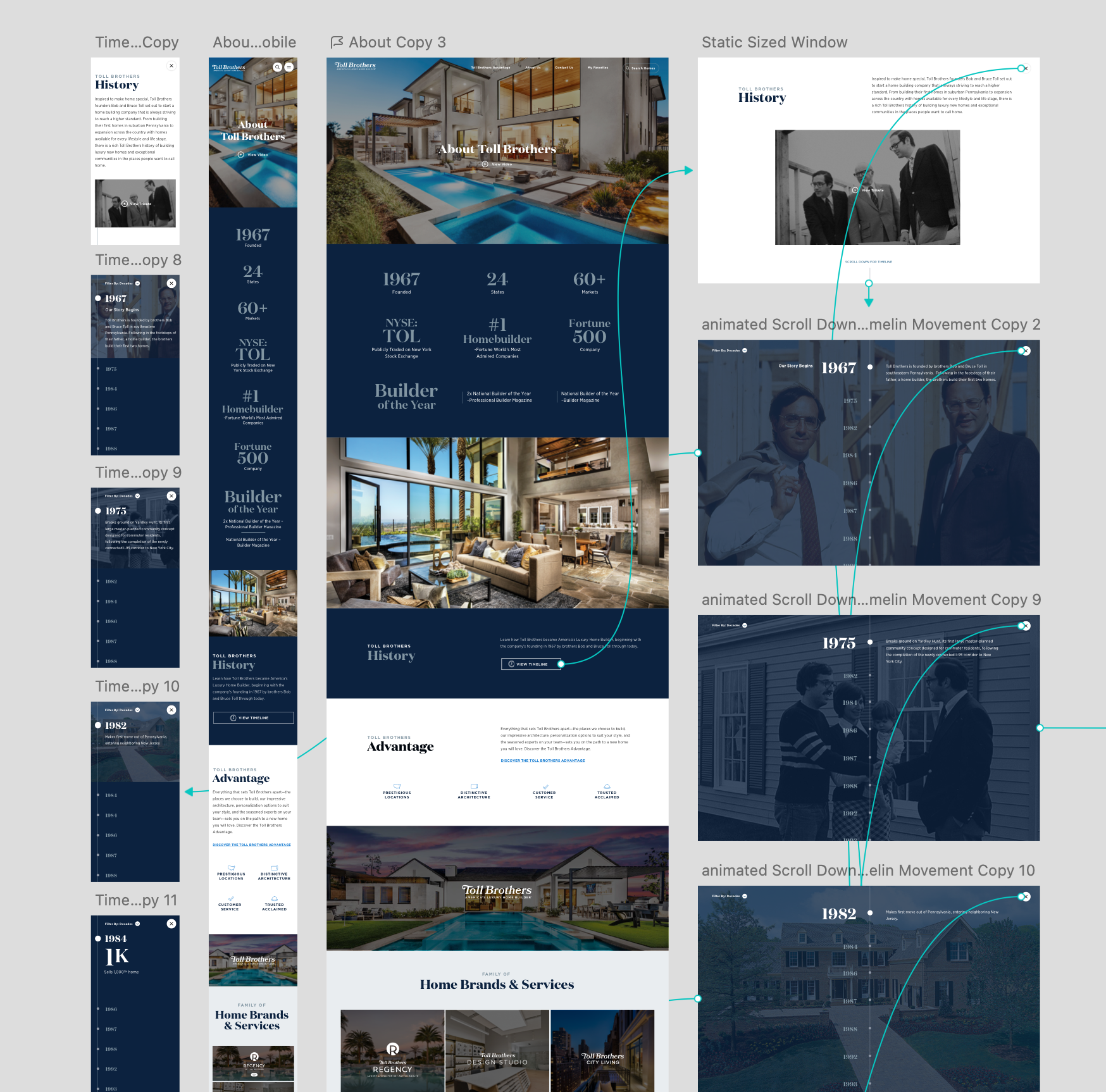
- A bold, mobile-optimized video intro hero - an immediate visual statement replacing the original text-heavy header
- A chronological heritage timeline, reformatted from a desktop-only layout into a mobile-friendly scroll experience
- Clear section-level navigation links to Toll Brothers Advantage, Brands & Services, and Careers
Key Design Decisions
Video hero over static photography. Despite higher production cost, video created an immediate emotional connection that static imagery couldn't achieve for a brand built on craft and presence. Stakeholder sign-off required — we presented both options with supporting rationale.
Executive leadership photography section. Initially explored featuring named executives with photos and quotes. Removed after stakeholder review, legal concerns around attrition and brand dependency on individuals. Replaced with values-driven iconography instead.
CTA placement moved mid-page. Original brief called for a single CTA block at the bottom of the page. Repositioned to appear contextually within the narrative, after heritage and values — based on scroll depth data showing most users didn't reach the footer.
Prototyping & Iteration
- Created low-fidelity - prototypes tracing the full mobile user flow, with a focus on scroll pacing and section transitions
- Collected stakeholder feedback to refine messaging priorities and focus areas, leadership visuals, values icons, and heritage milestones
- Incorporated the Toll Brothers internal design system for layout components and typographic scale
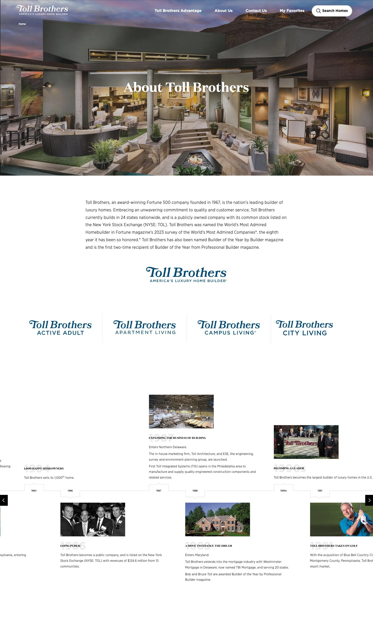
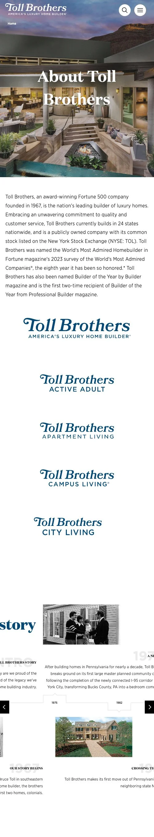
Final Solution
Brand storytelling that earns trust at every scroll.
The final design transformed the About page from an information dump into a brand story, one that builds credibility section by section and ends with clear, contextual pathways forward.
Values & Culture section
A clean layout with iconography representing prestige, design excellence, and personalization - translating abstract brand promises into visual language.
Heritage timeline
A scrolling chronological timeline showcasing legacy milestones, reformatted for mobile with concise copy and visual anchors at every major moment.
Strategic engagement CTAs
Contextually placed buttons leading to Communities, Design Studios, and Careers - positioned at the points in the narrative where user intent is highest.
Reflection & Next Steps
What worked — and what I'd push further.
This redesign proved the power of clear brand storytelling combined with mobile-first UX. The original page tried to say everything at once; the redesigned version builds toward a moment of conviction and that pacing makes all the difference.
"Story-driven design isn't about adding drama, it's about sequencing information so that trust is earned before action is asked."
Looking Ahead
- Incorporating social proof - awards, press highlights, and third-party endorsements, to reinforce brand authority within the narrative.
- Running A/B tests on messaging tone and CTA placement to validate which storytelling sequences drive the most downstream engagement.