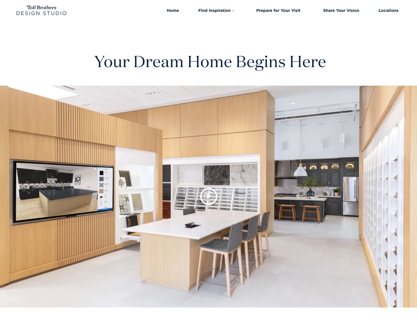
Overview
A refresh with no brief.
The Toll Brothers Design Studio website was due for a refresh. There was no formal brief, and stakeholders were still working out what they wanted. The project took more than two years.
What I did
- Explored options in wireframes — and showed them to stakeholders so decisions could be made.
- Restructured the pages — to tell a better story, in response to stakeholder feedback.
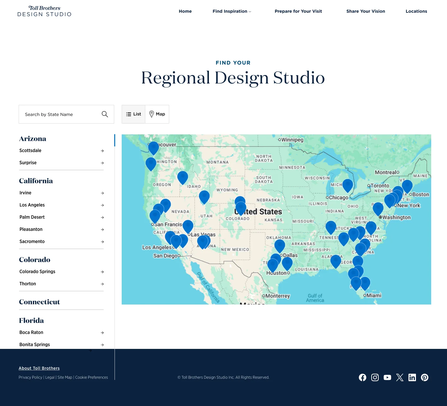
- Focused on two things — a better gallery experience, and an easier-to-view map of design studios across the country.
- Kept it moving — as project manager as well as UX designer.
Starting point
The site as it was.
The existing site was organized around five section links: What to Expect, How to Prepare, Inspiration, New Home Design Advantages, and Locate a Design Studio.
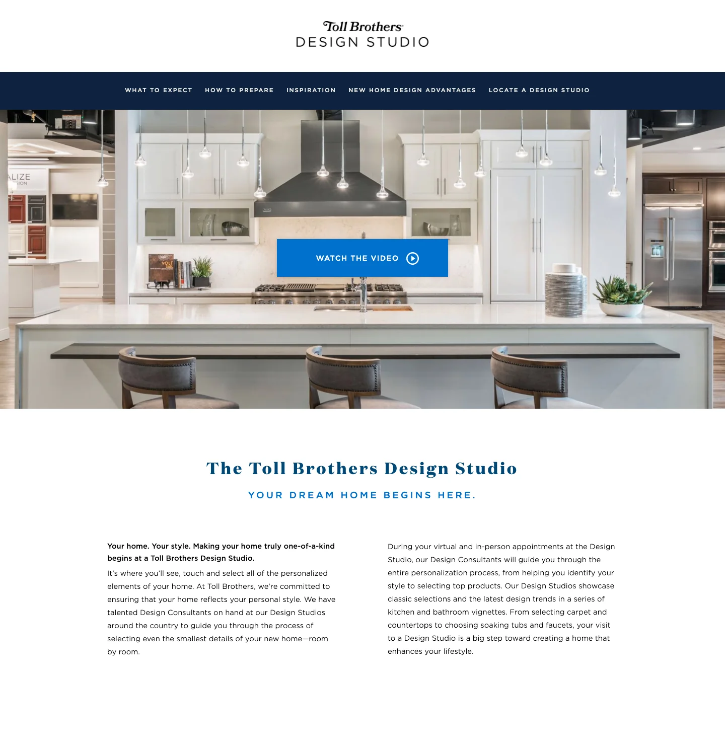
The existing Design Studio site, captured July 2024.
More screens of the old site3 pages
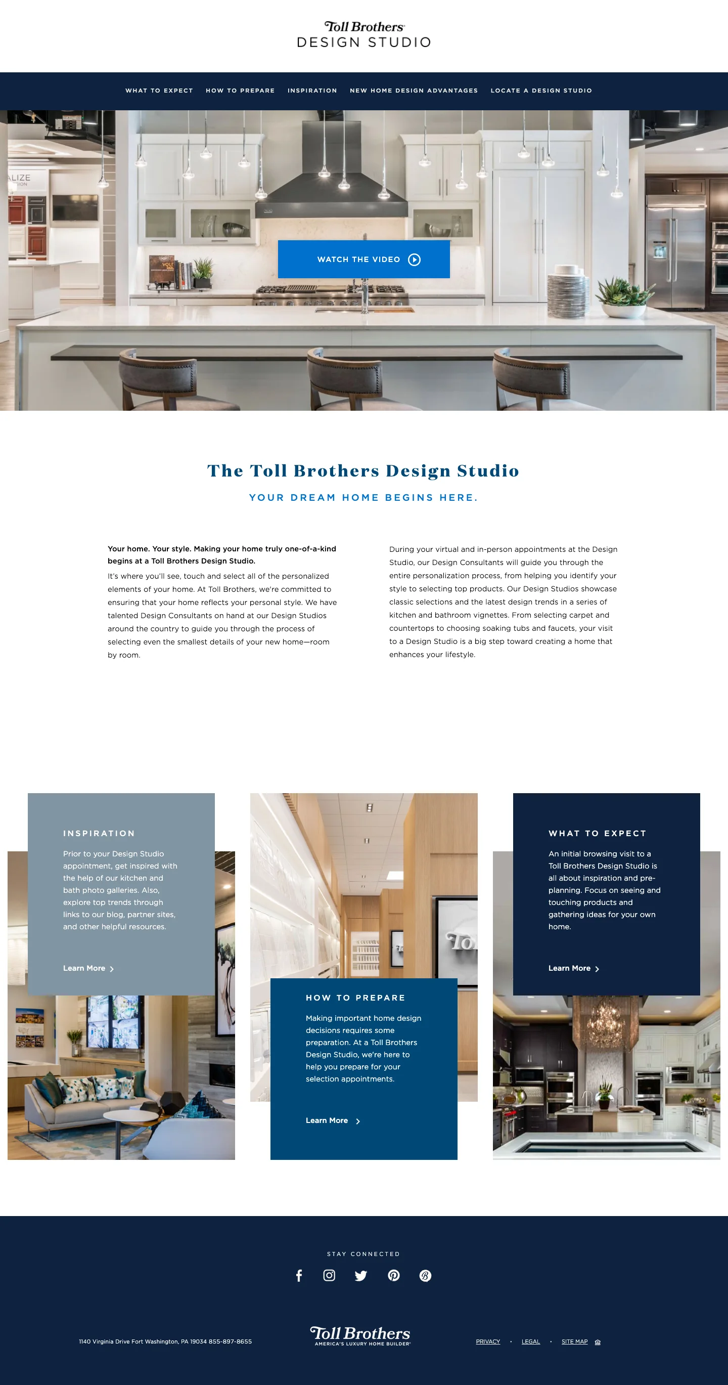
Home, captured July 2024.
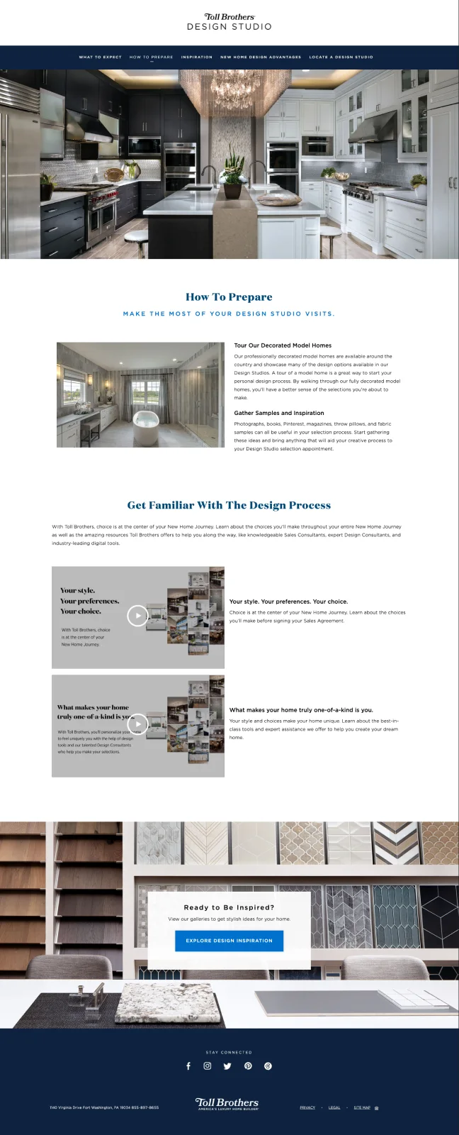
How to Prepare, captured July 2024.
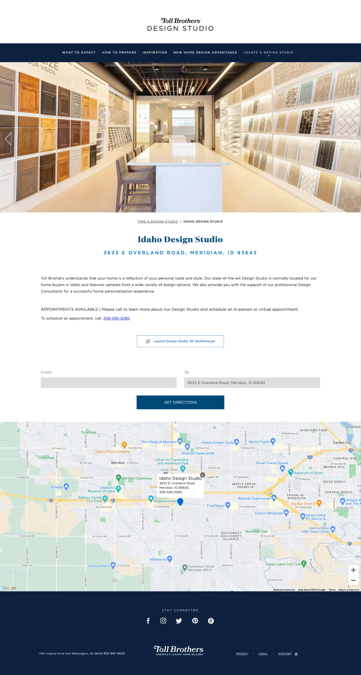
A single studio page (Idaho), captured July 2024.
Exploration
Testing structures in wireframes.
I explored the structure in wireframes before moving to visual design. The early versions kept the existing sections and tested a nationwide map with a state selector for finding a studio.
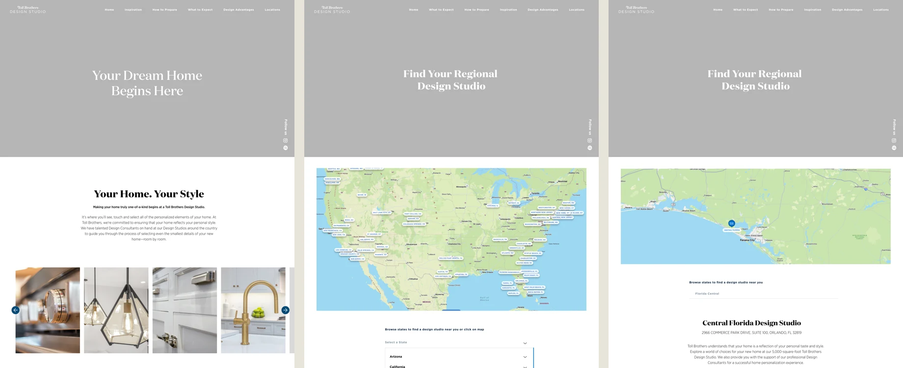
Early wireframes: Home, Locate, and Locate with a studio selected.
Beyond the early structure, I explored several other directions with stakeholders in wireframe, shown below.
More exploration4 directions
Home hero. Two arrangements of the same opening: the headline above the image, and the headline over it.
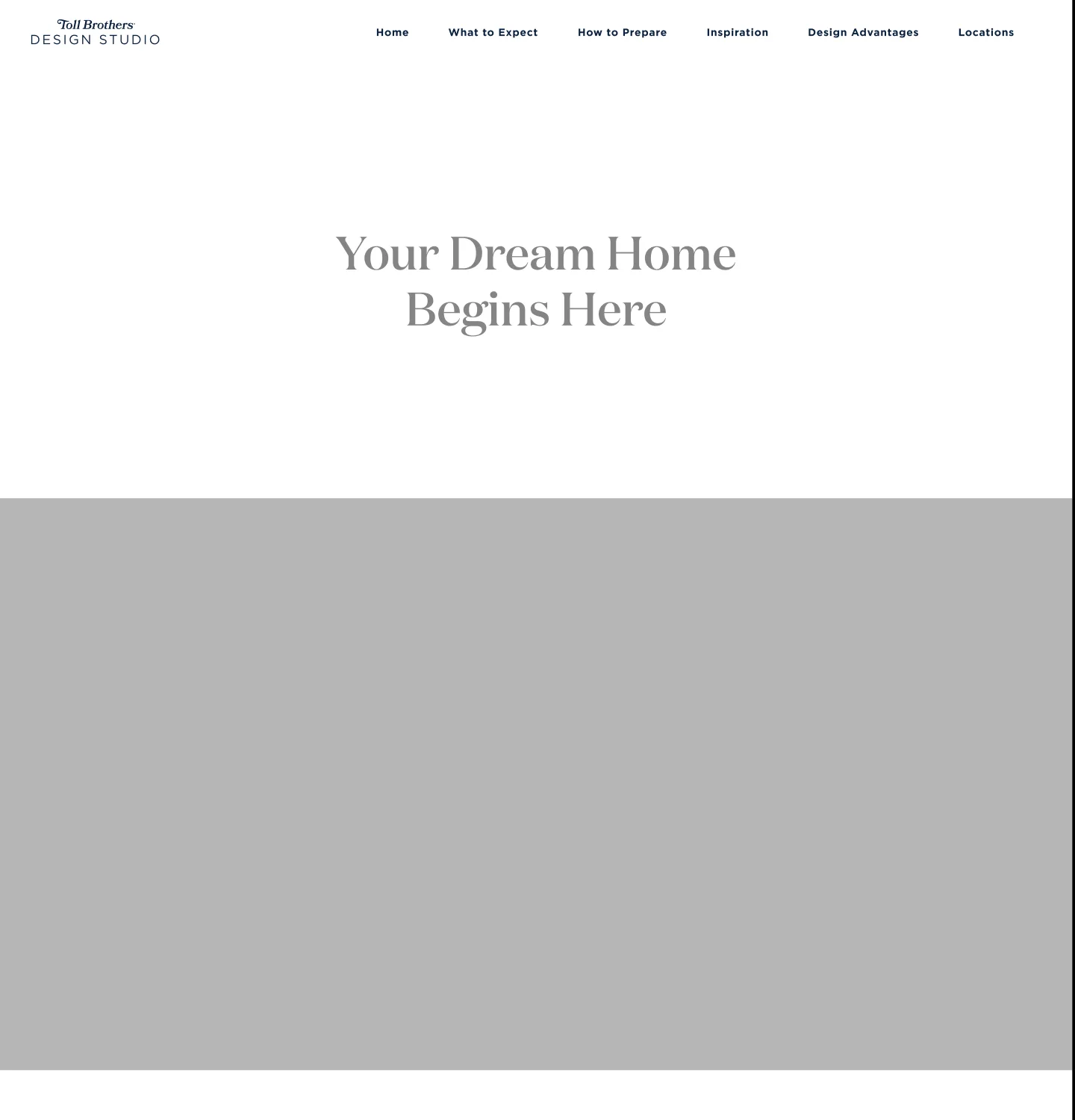
Hero option A: headline above the image.
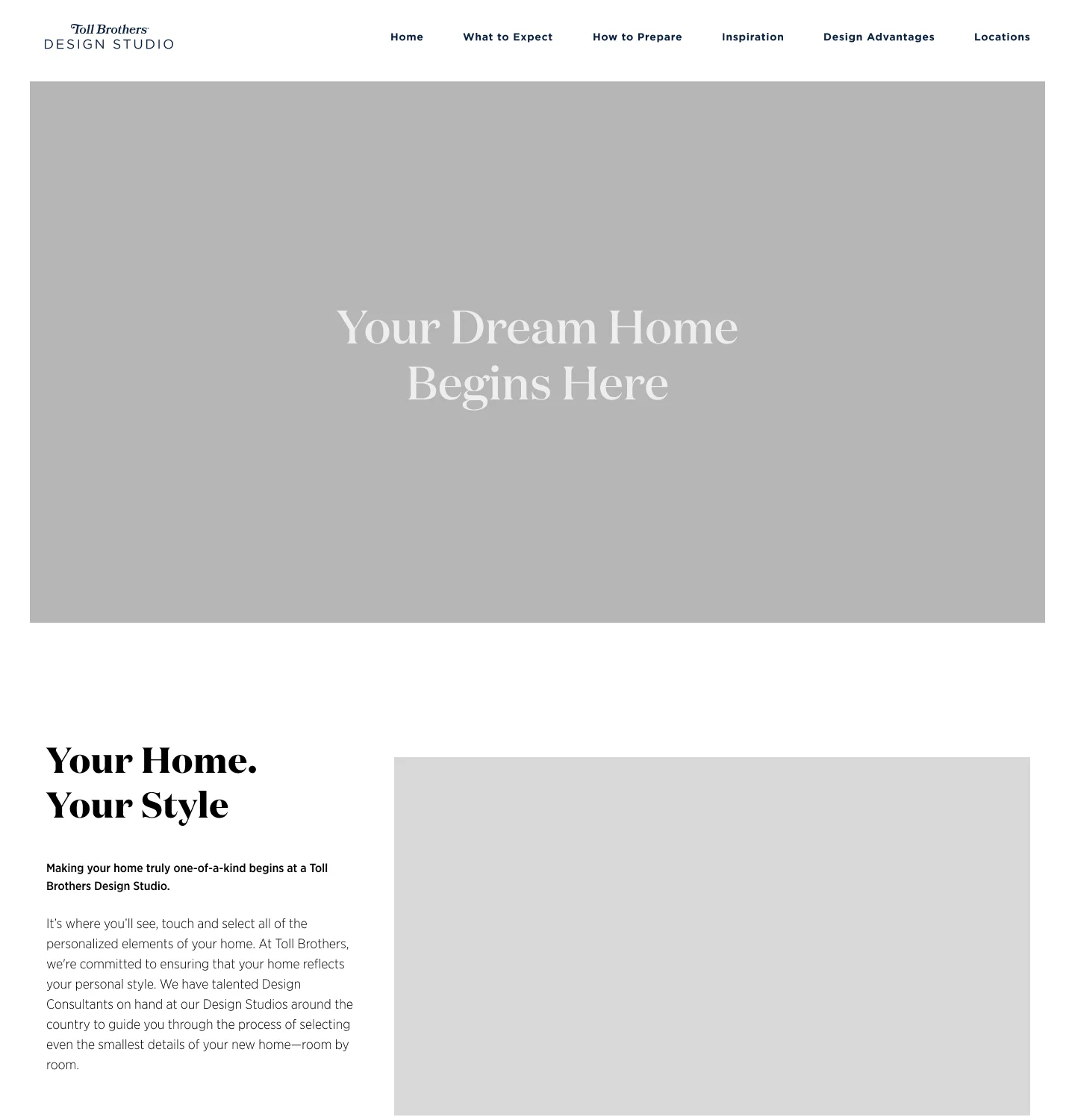
Hero option B: headline over the image.
Curated Collections. A page presenting nine named style collections, each with a grid of room images and a row of material swatches. One placeholder carries a note that higher-resolution images would be needed. It was one of several possibilities stakeholders explored. The idea went through changes and was ultimately left off the launch, with the option to add it in the future.
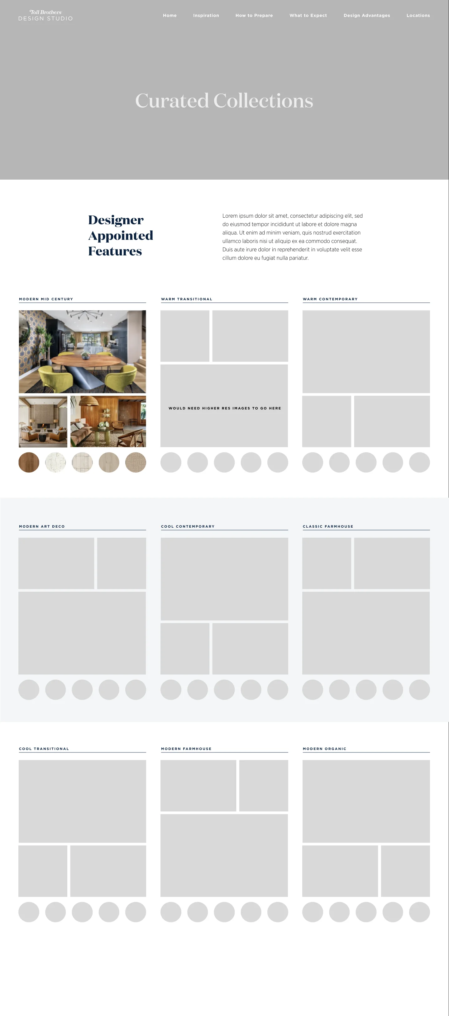
Curated Collections wireframe.
Style survey. A section pointing to a survey. My own note beside it asked whether the style collections could be chosen from a person’s results, with the caveat that the content to support that might not exist.
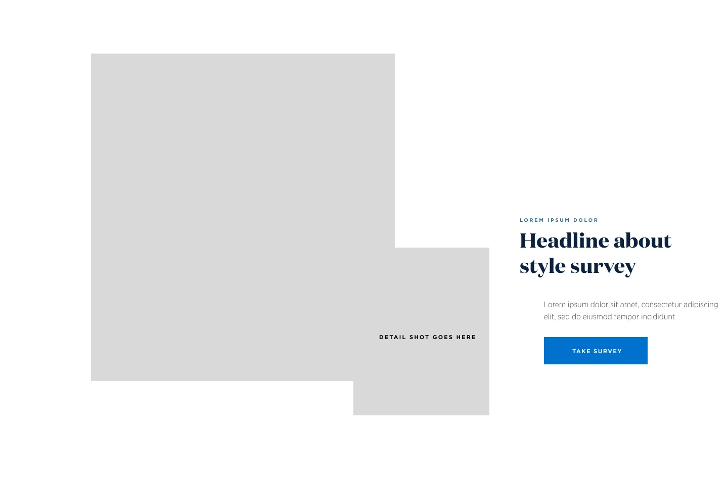
Style survey section wireframe.
Structure
Restructuring to tell a better story.
Stakeholder feedback asked for the pages to tell a better story, so I restructured the site. The result is three pages presented as steps, Find Inspiration, Prepare for Your Visit, and Bring Us Your Vision, plus Locations.
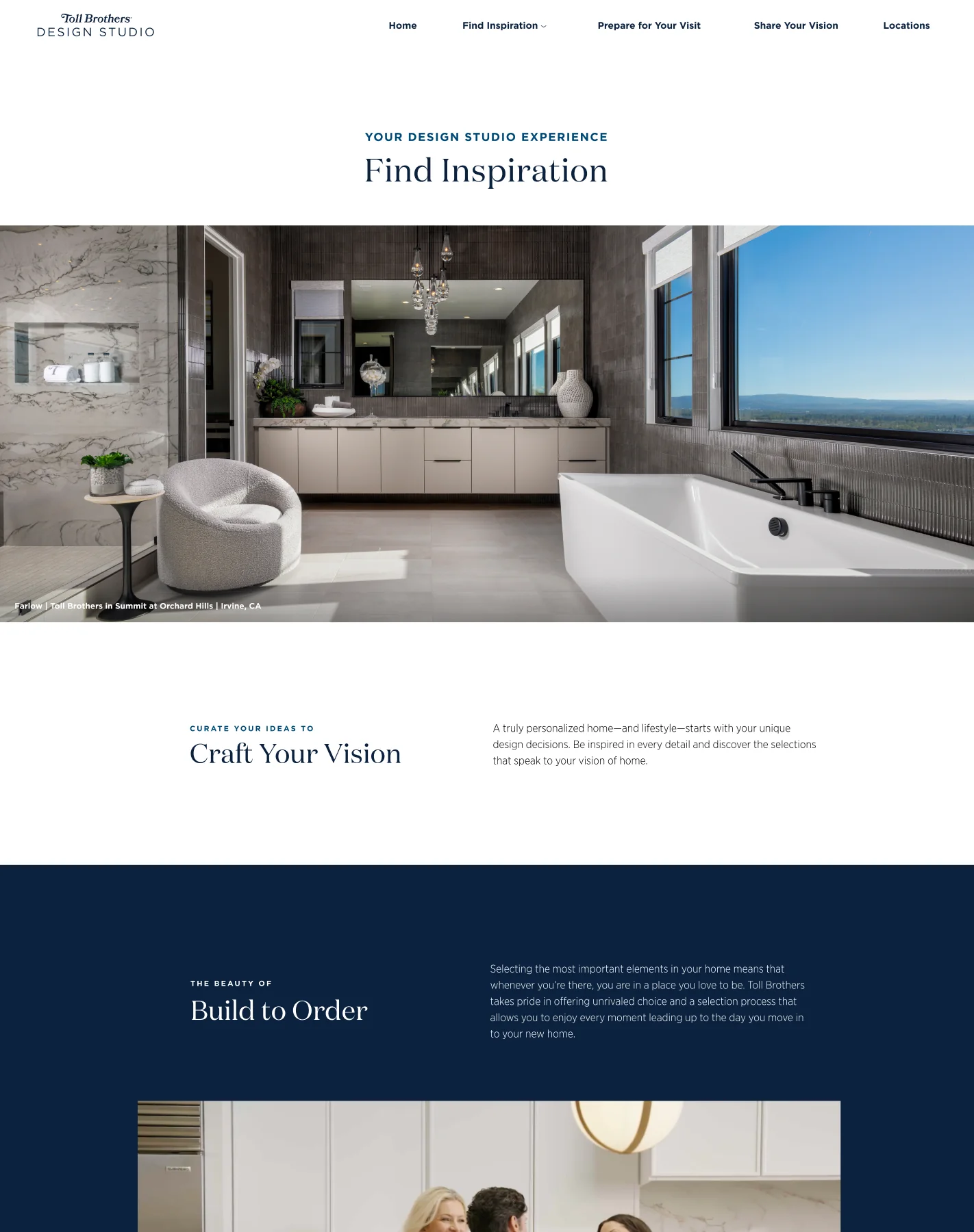
Step 1, Find Inspiration (top of page).
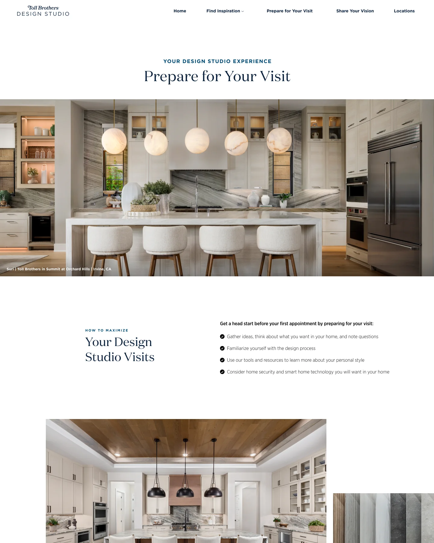
Step 2, Prepare for Your Visit (top of page).
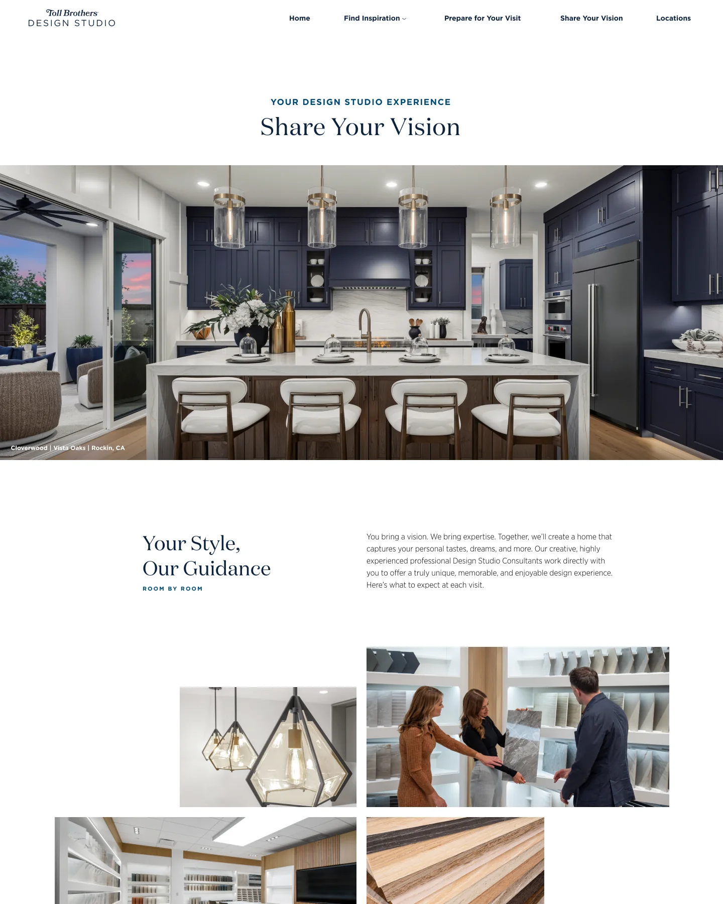
Step 3, Bring Us Your Vision (top of page). The design file used the working label Share Your Vision.
Gallery
A better gallery experience.
Galleries were one of my two focus areas. On Find Inspiration, Kitchens and Baths each lead into a gallery from a View Gallery button, which opens a full-screen gallery with an image counter.
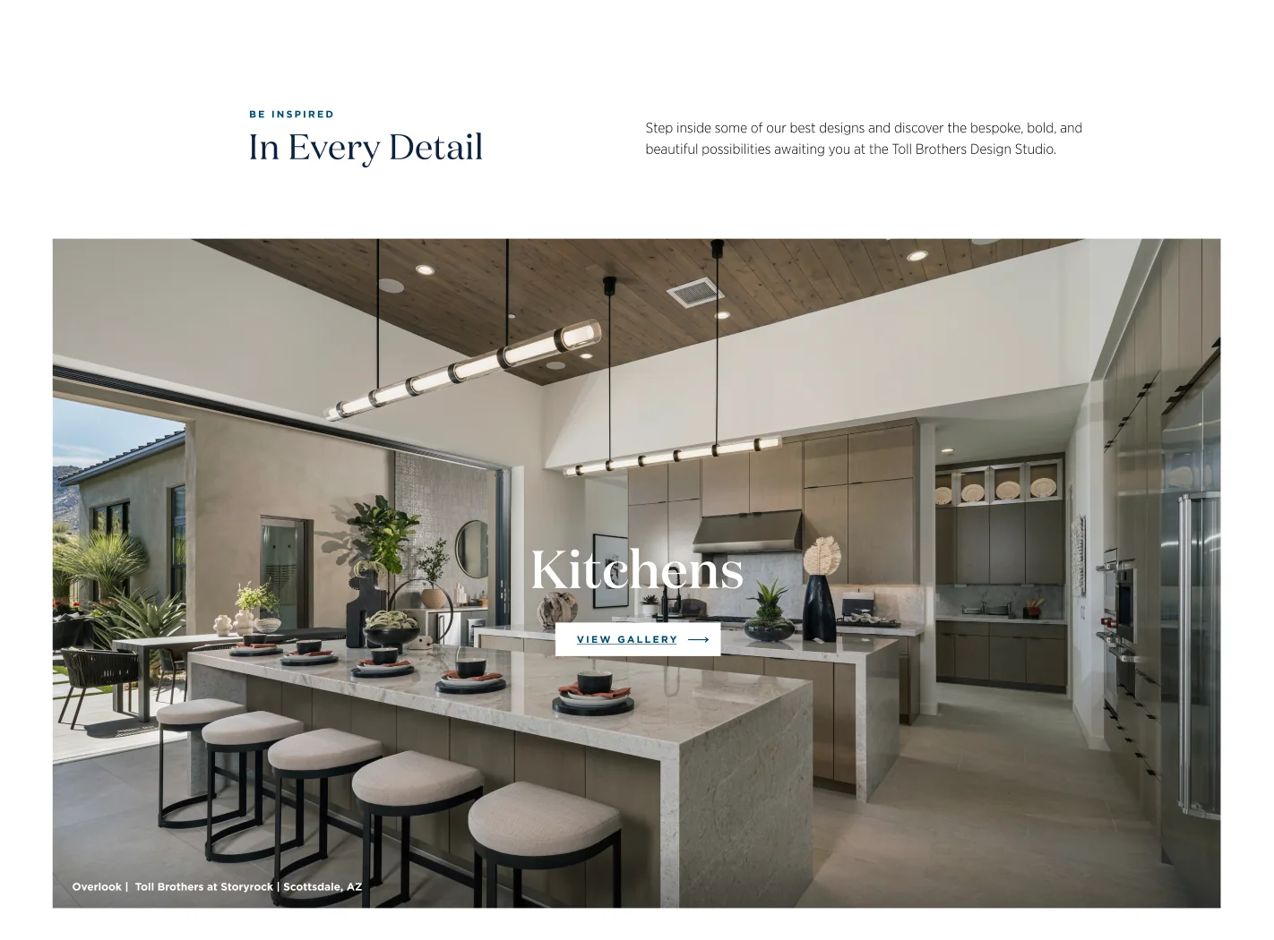
Find Inspiration: each room type leads to its own gallery.
The galleries feature the Designer Appointed Collection kitchens and baths. To get the interaction right, I built each one as a working HTML file, using Claude. I loaded the images, gave each one a tag, and described how the gallery should load into the site and how the animation should work. I linked the Figma prototype to those files so stakeholders could review and approve the behavior, then provided the files to the development team.
How the galleries workKitchens and Baths, 11 images each
- Opens from the page. The hero image expands to fill the screen when the gallery opens, and shrinks back to the hero when it closes.
- Moves one image at a time. Scroll, arrow keys, swipe, or tick marks on the right edge. Each new image slides up over the last.
- Always shows where you are. A counter, tick marks and a thin progress bar track position, and a Back button (or the Escape key) returns to the hero.
- Every image is tagged with the home design, community, and city and state.
Kitchens gallery, recorded from the working HTML file.
Baths gallery, recorded from the working HTML file.
Stakeholders approved the galleries as built, and liked how they showcased the Designer Appointed Collections.
Map
An easier-to-view map of design studios.
The map was my other focus. The Locations page shows design studios across the country on one map, with a List view grouped by state and a search by state name. Selecting a studio opens its details, and a video can open in an overlay.
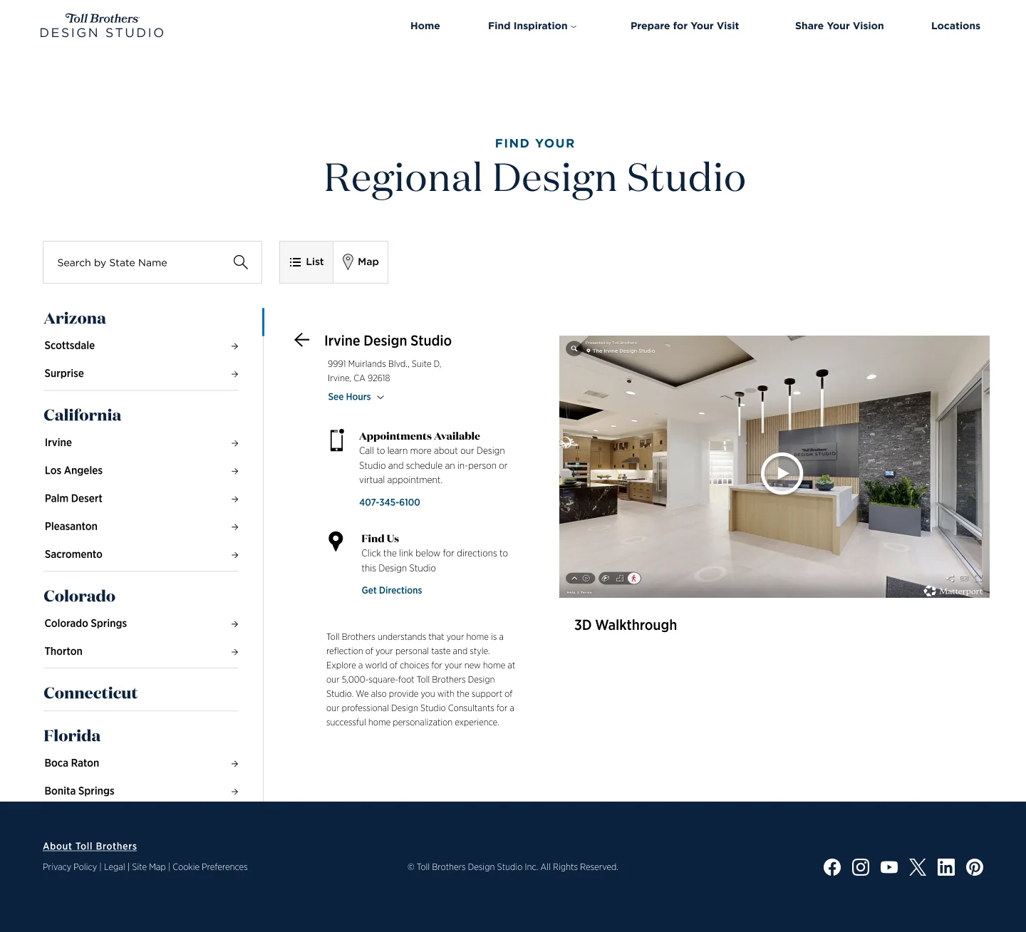
A studio selected.
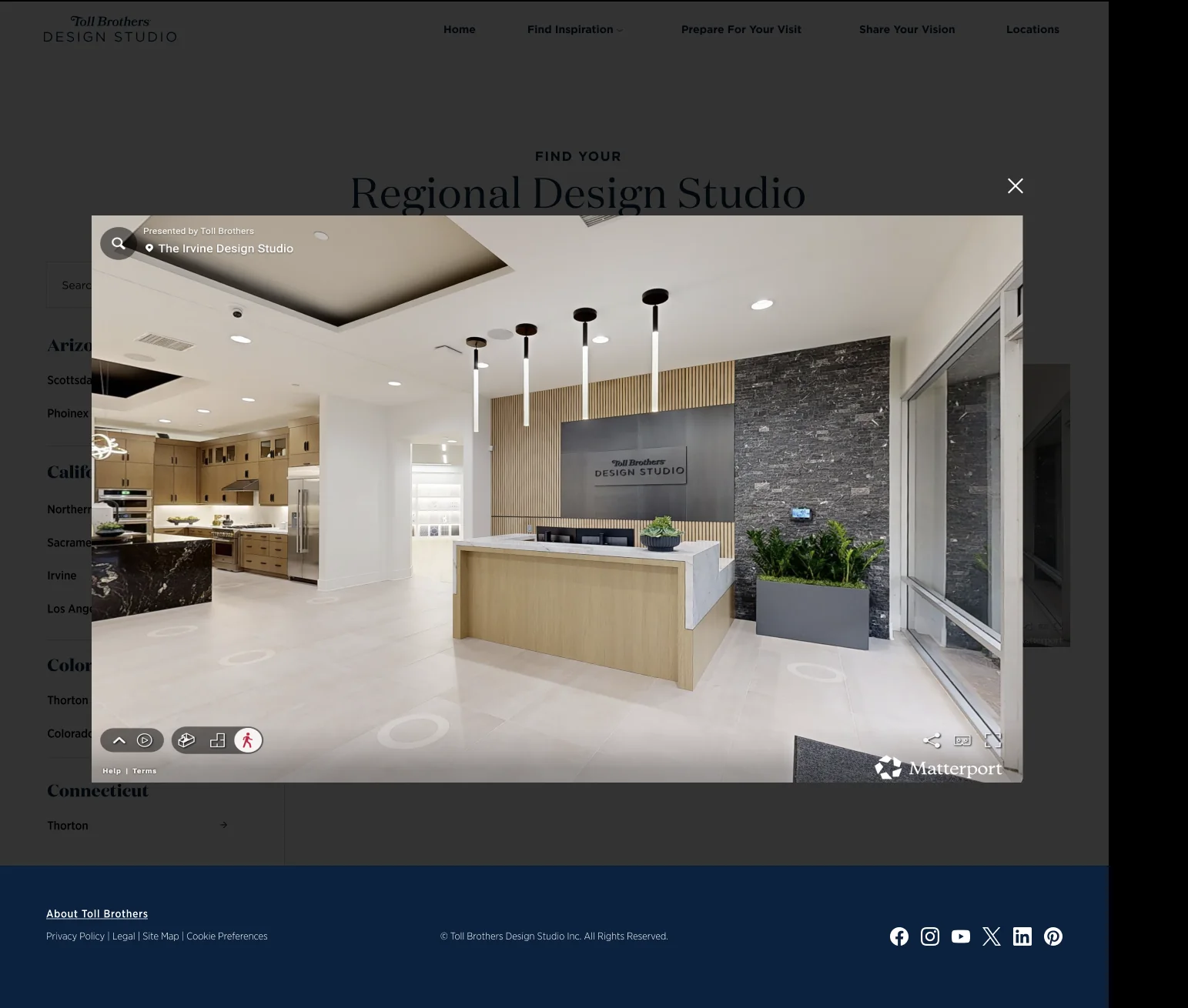
Video overlay.
Mobile
Designed for desktop and mobile together.
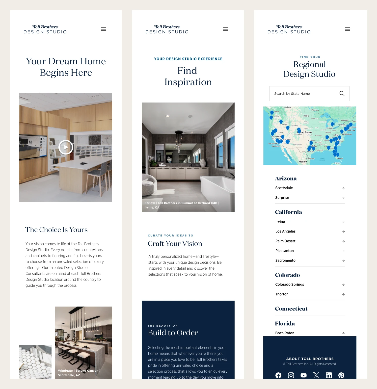
Mobile screens: Home, Inspiration, and Locations.
Delivery
Keeping a long project moving.
The direction took time to settle. As project manager, I kept the work moving while it did, and showed stakeholders options so decisions could be made. The site is live.
View Live Site