Overview
A cluttered list view was slowing buyers down at the most critical moment.
Toll Brothers' mobile list view for home search was buried under overlapping tags, dense metadata, and image thumbnails fighting for attention with status labels. For buyers browsing on their phones — often their first and most frequent touchpoint — the experience made it harder, not easier, to find a home they connected with.
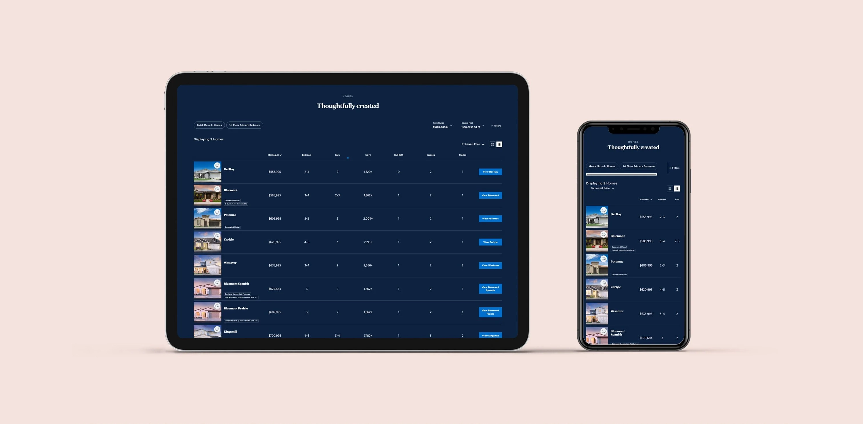
In a focused two-week sprint, I redesigned the interface to be image-first, scannable, and mobile-native — reducing visual noise through simplified tag treatments, an image-led card structure, and a sticky context header that kept key information visible while buyers scrolled.
My Ownership on This Project
Heuristic Review
Audited the existing list view for usability failures, and benchmarked mobile list patterns from Zillow and Redfin
Wireframing & Prototyping
Explored alternative tag placements, horizontal scroll layouts, and sticky header treatments in low-fidelity mockups within Sketch
Visual Design & Handoff
Delivered final high-fidelity screens within the Toll Brothers design system, tested with 3 participants before handoff
Discover
The problem: overlapping tags turning a browse into a chore.
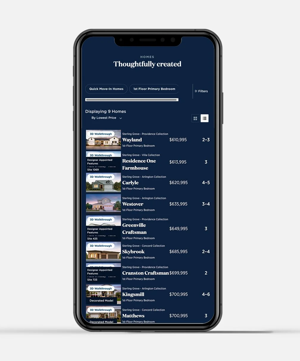
The existing mobile list view displayed multiple status tags simultaneously — "3D Walkthrough," "Designer Appointed Features," "Quick Move-In," "Decorated Model" — stacked or overlapping directly on top of home exterior images. The result was a wall of labels that obscured the imagery buyers actually came to see, and made it nearly impossible to scan quickly.
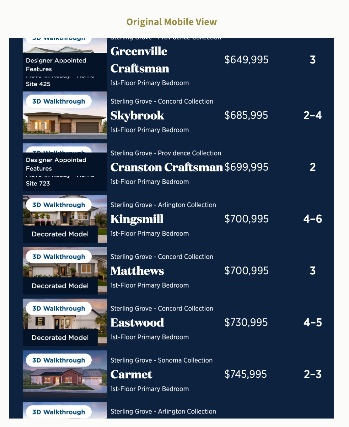
The original mobile view. Multiple overlapping tag labels compete with home imagery, and metadata density makes scrolling feel slow and effortful.
Research Methods
- Heuristic review - identified tag overlap, poor touch target sizing, and lack of visual hierarchy as the primary failure points in the existing list view
- Analytics review - analyzed session data to identify where mobile users were disengaging within the list view, pinpointing drop-off patterns
- Competitive benchmarking - studied list and card design patterns from Zillow and Redfin to understand how leading real estate apps handle badge and metadata density on mobile
Key Findings
Tag overlap severity
Critical
Multiple label types (QMI, DAF, Decorated Model, 3D Walkthrough) collided in the image area, degrading both scannability and perceived quality.
Touch target quality
Failing
Tag badges and interaction targets were too small for confident mobile tapping, creating accidental activations and friction during browsing.
Define
Aligning on what mobile buyers actually need from a list view.
User Needs
- A clean interface that highlights homes at a glance
- Fast, frictionless scrolling without visual noise
- Key information (price, name) immediately readable
Business Goals
- Increase engagement and ease of browsing in the list view
- Facilitate faster home selection and reduce dropout rates
- Maintain tag visibility without sacrificing image clarity
Design Objectives
Decrease visual clutter through simplified tag treatment
Restructure or simplify tag placement so status labels inform without overwhelming, moving toward icon-based or de-emphasized badges that don't compete with imagery.
Improve scrolling flow with a horizontally-oriented layout
Explore a horizontal scroll layout with image-focused presentation, making the list feel native to mobile rather than a compressed desktop table.
Keep key information anchored as users scroll
A sticky header element showing the home image and price keeps buyers oriented mid-scroll, reducing cognitive load and the need to scroll back up to reorient.
Design Process
Exploring layouts that put the home - not the labels - first.
I explored several alternative treatments for the tag problem: repositioning badges to corners, collapsing them into a single indicator dot, using icon-only marks with optional tooltips, and testing a fully horizontal swipe layout. Each direction was sketched and evaluated against the core brief — fast, clean, mobile-native.
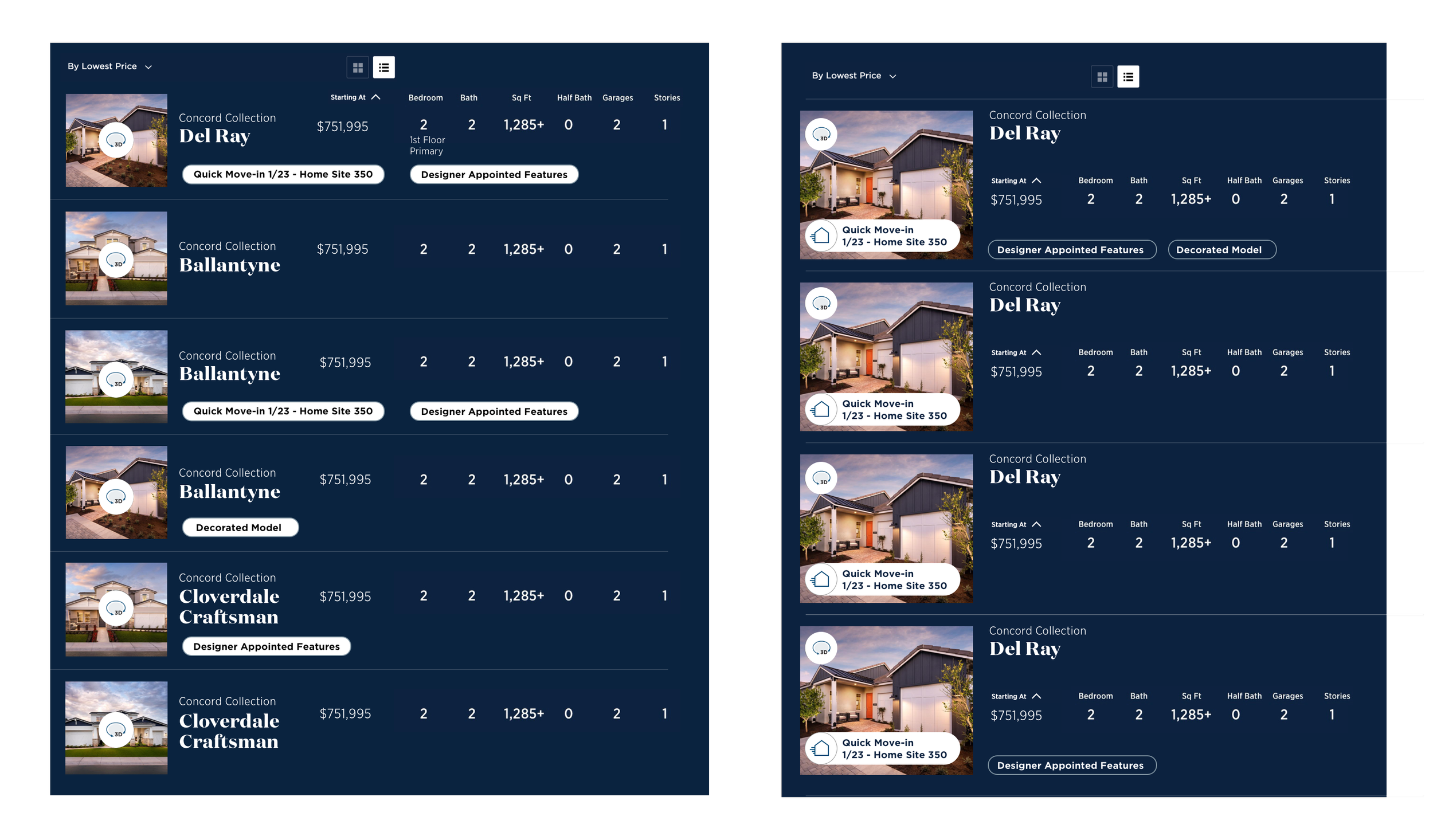
Early explorations testing tag repositioning and information hierarchy across two layout directions.
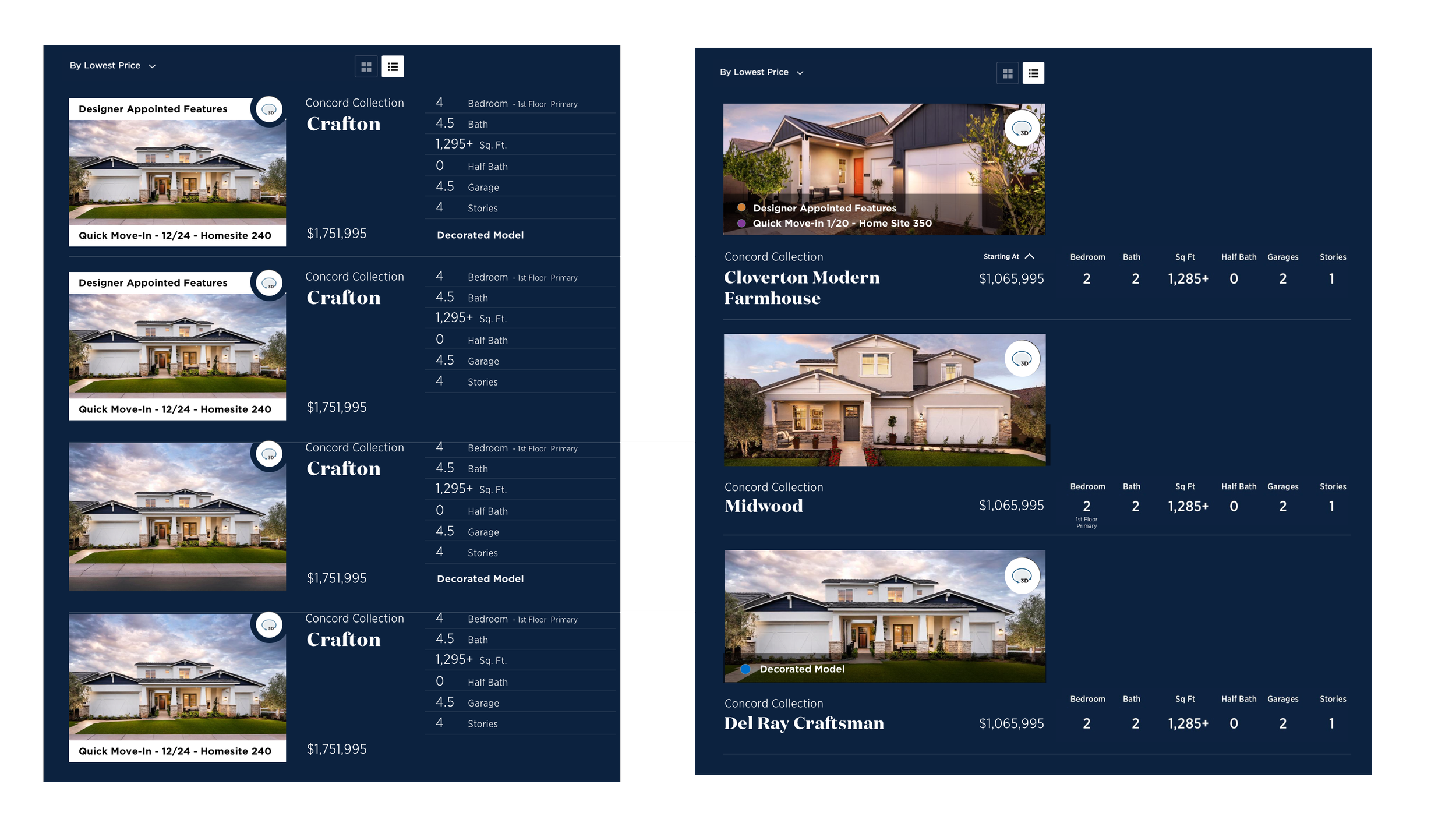
Further iterations testing a larger image footprint, collapsed badge treatments, and sticky header behavior.
Features Explored in Wireframes
- Minimal tag design - icon-only status indicators with optional hover/tap tooltips replacing full text label stacks
- Horizontal scroll layout - image-forward cards optimized for thumb-based swiping on mobile
- Sticky image + price header - a persistent context strip that stays visible as users scroll through metadata rows
- Consistent visual hierarchy - price, plan name, and key specs legible at a glance with a clear size and weight scale
Usability Testing
I conducted usability tests with 3 participants using the Sketch prototypes. The findings were clear: participants strongly preferred the cleaner visual presentation, found horizontal scrolling more natural for mobile browsing, and confirmed that sticky elements significantly improved their ability to stay oriented mid-scroll without adding clutter.
Image-first card structure - all three test participants responded positively to leading with the home photo before metadata. Aligns with the card view preference already observed in analytics.
Sticky info header - confirmed through testing that anchoring image and price significantly reduces scroll-and-back behavior, a key friction point in the original.
Horizontal scroll on mobile - felt natural and thumb-friendly in testing. Gave each home more visual breathing room without reducing information density.
Full tooltip-on-tap for icon-only tags - participants occasionally missed the meaning of icon-only indicators without a label. Full icon treatment deferred to a future pass with more testing time.
Deliver
A cleaner, faster mobile browse — before and after.
The final design resolved the tag-overlap problem by simplifying status indicators and giving the home photography the visual priority it deserved. The sticky header, clean card rhythm, and reduced label density made the list view feel like a natural mobile experience rather than a compressed table.
"Buyers need to feel something when they see a home, clutter was getting in the way of that."
Before vs. After
Original view: overlapping labels obscure home imagery and make scanning effortful.
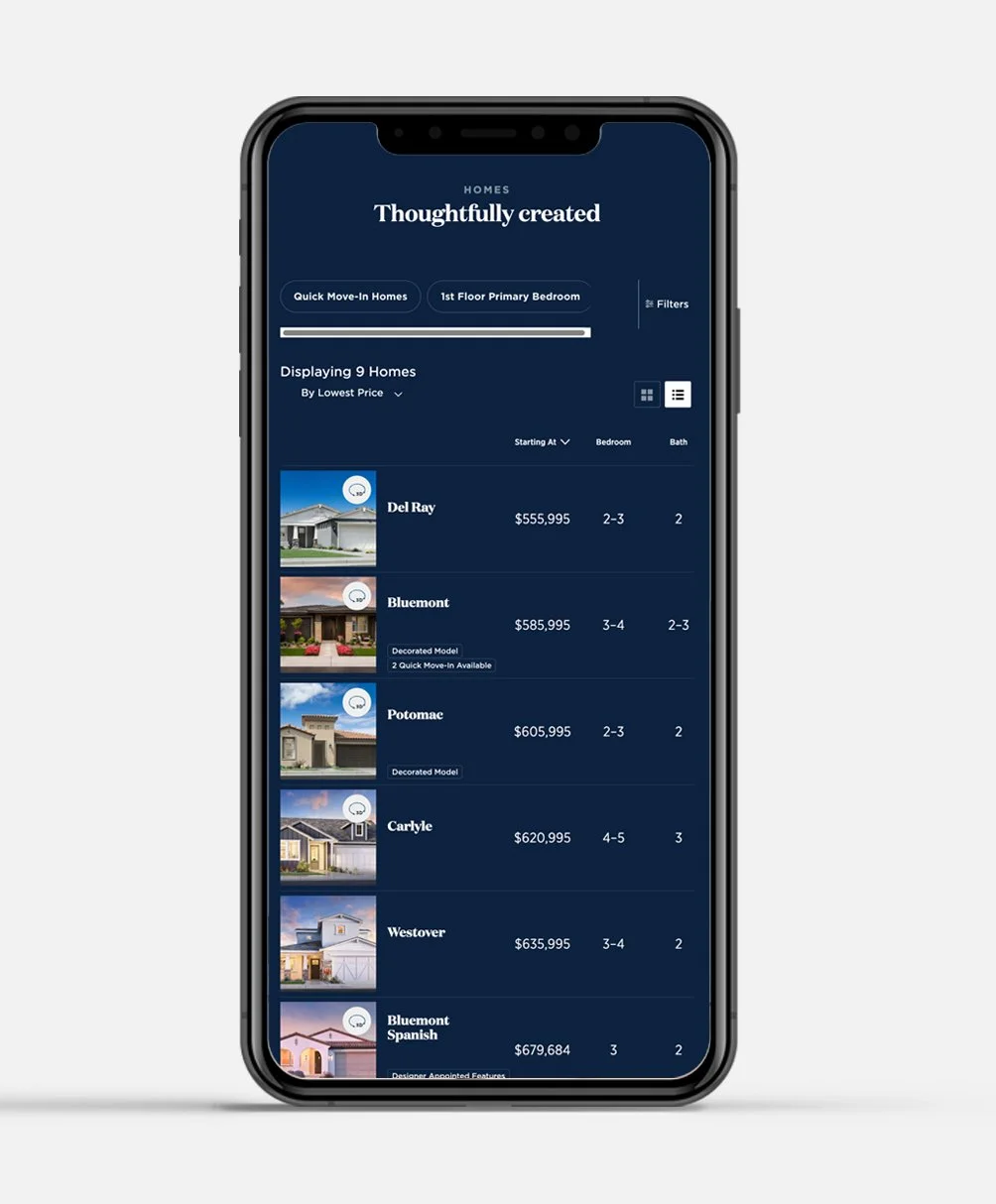
Redesigned view: image-led, clean tag treatment, sticky column headers for orientation.
Final Design Highlights
- Reduced tag noise - status indicators simplified and repositioned so they inform without competing with home imagery
- Image-first hierarchy - home photo leads each row, with plan name, price, and specs following in a clear weight scale
- Sticky column header - key specs (Starting At, Bedroom, Bath) remain anchored as users scroll, eliminating the need to scroll back up for context
- Horizontal layout option - optimized for thumb-based mobile browsing with card-style presentation that matches how buyers already browse on mobile
Reflection & Next Steps
What I'd do differently — and where the list view goes next.
This sprint moved fast by necessity, which meant some decisions were made with limited quantitative backing. Aa live A/B test would have given us confidence to push further with the tag simplification.
"If I could go back, I'd push for an A/B test in a live environment before declaring the horizontal scroll the winner."
Looking Ahead
- Exploring A/B testing in a live environment to capture quantitative metrics - conversion rates, scroll depth, and time-to-selection — across the before and after treatments at scale.
- Investigating expanded metadata reveals on tap - letting buyers surface additional specs inline without navigating to the plan detail page, reducing pogo-sticking between list and detail views.