
Interactive Site Plan (ISP) Case Study
Role — UX Designer
Duration — 4 Months
Tools — Sketch, Workfront
Project Overview
Toll Brothers sales centers rely heavily on an Interactive Site Plan (ISP) to showcase available home sites, community amenities, and Quick Move-In (QMI) homes to prospective buyers. The existing tool was outdated, difficult to navigate, and failed to support self-guided exploration or filtering.
Our goal was to modernize the ISP to make it more intuitive, interactive, and sales-friendly—supporting both sales consultants and buyers during in-person tours.

—Discover
The Problem
The existing ISP was a limited-interactive kiosk tool that required heavy sales consultant guidance. Homebuyers had no ability to explore homes independently or filter by availability or floor plan preferences. Sales reps often had to manually reference paper sheets or PDFs, interrupting the sales flow.

Research Methods
Stakeholder Insights Gathering
Usability Audit of the current ISP
Key Findings
Users had difficulty understanding which home sites were available at a glance.
Quick Move-In homes were hard to find and often buried.
The original ISP lacked essential features such as the ability to scroll through listings or save favorites.
Lacked an efficient way to compare homes side-by-side.
—Define
User Needs
Buyers want to browse at their own pace, filter by preferences, and visualize availability clearly.
Sales Consultants need a quick, interactive tool to answer questions and present options.
Business Goals
Streamline home selection to shorten the decision-making process.
Promote Quick Move-In homes more effectively.
Reduce reliance on printed collateral and manual updates.
Design Goals
Create a visually intuitive, filterable map for buyers and sales reps.
Highlight Quick Move-In homes and key community amenities.
Redesign and create a better integrated registration flow for buyer follow-up.
The existing registration process relied on a printed QR code scanned during design studio visits—a workflow that wasn’t optimized for mobile use.

—Develop
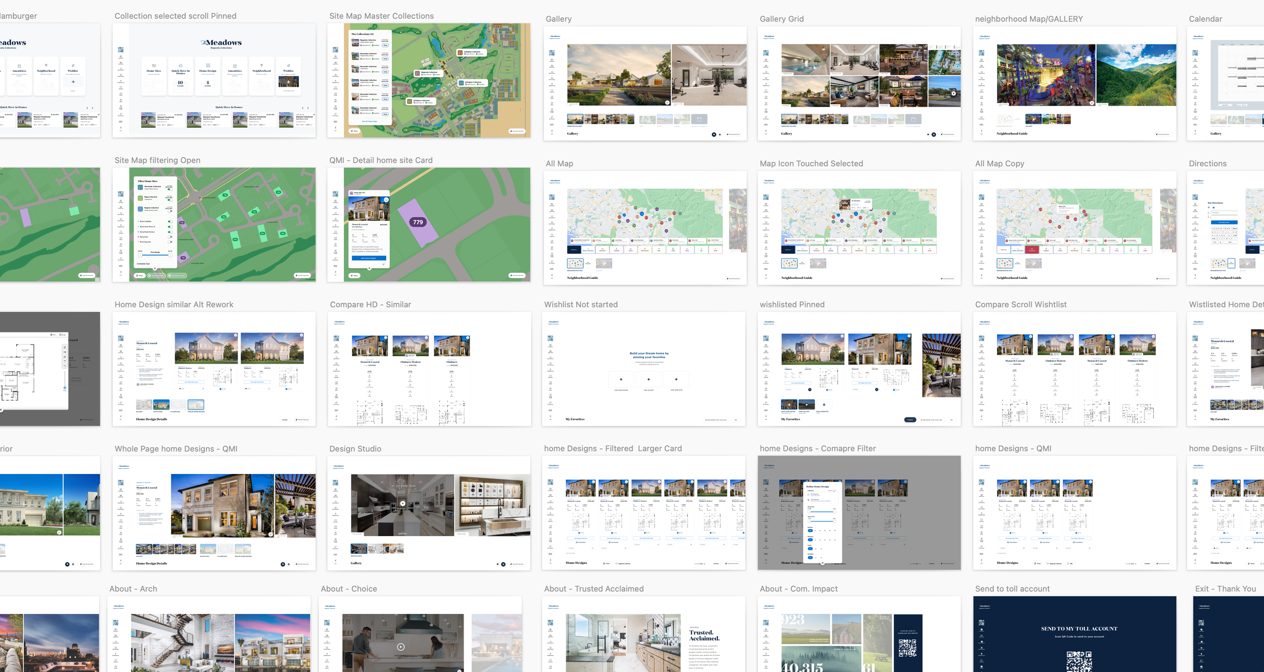
Ideation & Wireframing
We began with a collaborative sketching session and created a feature prioritization matrix with stakeholders. Then we developed wireframes and low-fidelity prototypes to test layout, filtering logic, and map interactivity.
Key Features Explored:
Home site filters (plan, price, availability, QMI)
Tap-to-view home details
“Favorites” for saving top picks
Quick Move-In cards on homepage
Simplified digital registration form with integrated QR code (no more printing)

Iteration & Testing
We conducted evaluation sessions to inform design improvements.
Key Insights from Testing:
Users preferred a persistent map with dynamic filters.
Emphasizing time-sensitive options improved discoverability.
Digital registration needed to be shorter and more contextual.

Digital registration ideations
Design System Integration
All components followed the Toll Brothers design system and accessibility standards—ensuring consistency and scalability across community sales centers.
—Deliver
Final Solution
The final design included:
Interactive, responsive map with availability filters
Visual badges for Quick Move-In homes
Tap-to-view overlays with home/site info
Outcomes
User engagement time increased by 30% during home tours visits
Sales consultant satisfaction improved in post-launch surveys (Positive Reviews from internal sales teams)
Printed materials reduced by 60%
Tool adopted by all new communities within 3 months of launch

—Reflection & Next Steps
This project reinforced the importance of designing tools that empower both users and internal teams. If I could go back, I’d push to test with real buyers earlier in the process. Looking ahead, we’re exploring how to integrate this tool into the public-facing website for lead generation beyond the sales center.